“Portraits with Purpose” Social Media Ads

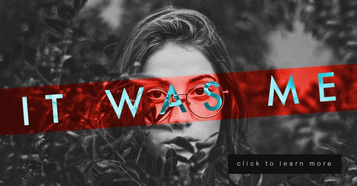
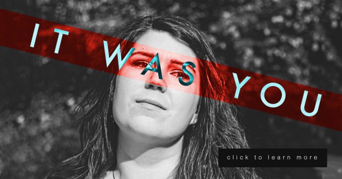
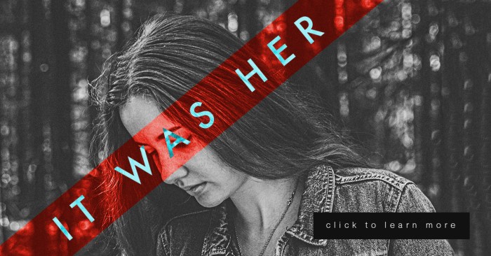
This week is a continuation of my last project in Illustrative Imaging, in which we took three portraits and created a social media campaign concept that would tie them together. This week we added a text “tagline” and a “call to action” button. My concept for these portraits was building on the #metoo campaign and the controversy it sparked. My portrait series and social media campaign is in response to the doubt and backlash women received after coming forward to report sexual assault. My campaign is an answer to those who ask “Who are all these women coming forward with allegations?” well, “It was her.”

For this series, there are three images of women so I decided to use a different phrase for each, which were the following: “It was her” “It was you” and “It was me.” They each draw attention to the fact that there are many individuals out there who have been sexually assaulted that are not making false allegations.

Each portrait will link the viewer to an interview with each sexual assault victim and will ask for a donation to the #metoo charity fund that goes towards the aid of sexual assault victims.

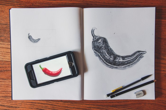
I did many sketches and variations of my design (included below) but I kept coming back to the idea of the women’s mouth or eyes being covered. The mouth or eyes being covered symbolizes the suppression of the woman’s voice and the blindness of society to the victims. So, I decided to use a technique from the “Bada** Photoshop Effects” book we are reading in class. In the book they use different layer styles to overlay text on images in interesting ways.

To create these images, I first made a red rectangular shape to go over the eyes and changed the layer style to “overlay.” I then put white text over the image and changed the text layer style to “difference.” I thought it was a very interesting effect. (Images below.)

Estep-Social03

Estep-Social02.jpg

Estep-Social01

Drawing Fundamentals – Weeks 3 & 4

Fall Semester is in full swing and with it comes work, work and more work. Luckily, I love what I’m learning and a lot of times it doesn’t feel like work, especially when it comes to my Drawing Fundamentals class.
These past few weeks we’ve been focusing on texture and proportion. Week 3 was an exploration of texture through imitation. Below are the 12 textures I imitated in my sketchbook.

estep-texture-page-001
On the surface this assignment seemed easy but was actually quite difficult. One of my biggest challenges as an artist and a designer is having patience, especially with repetitive tasks. This involved a lot of repetition, because the basis of texture is pattern and pattern is based on recognizable repetition. This exercise forced me to slow down my method and to really look at my subject when creating texture, rather than inventing what I think the texture looks like in my mind.

Week 4 we moved on to proportion. Our lecture focused on logos and how they are based on recognizable objects that have been simplified to their most simple forms. They are recognizable as the original object in huge part due to their proportion. Below are my initial 18 thumbnail sketches of a pepper for the assignment.

estep-scale-thumbnails-page-002estep-scale-thumbnails-page-001

The next step was to take 3 of your most interesting thumbnails and develop them further. Below are my 3.


Finally, you were to take 1 sketch of the 3 refined thumbs and draw it at the scale of a standard business card, as well as that of a standard letterhead. Below are my final drawings as well as the original object.

IMG_3324-2

estep-scale-bizcard-8.5x11-page-001estep-scale-bizcard-8.5x11-page-002

Drawing Fundamentals – Week 2

Today I finished up week two of my Drawing Fundamentals class. Although I’ve been drawing since childhood, I still feel that I have a lot to learn. This weeks assignment was to watch a few videos on cross hatching, stippling and shading as well as draw a still life from four angles. Below is my completed still life sketches. (Total duration to complete all four drawings ~45 mins.)

IMG_3213

still_lifes

This exercise helped me loosen up a bit and get more comfortable with sketching again. I tried drawing more with my arm instead of just my wrist, which allowed me to draw more loosely.
The biggest challenge for me in this assignment was proportion. The carton object in my still life provided the biggest challenge, it was too tall for the small quadrants on my sketchbook page so it kept getting cropped out of each composition. The lighting I had was also challenging, because there were two competing light sources – the ambient light from the window and the light from the lamp to my back right.
This exercise would be great for any artist who wants to loosen up their sketching style and practice shading forms of different shapes and sizes.