Fall Semester is in full swing and with it comes work, work and more work. Luckily, I love what I’m learning and a lot of times it doesn’t feel like work, especially when it comes to my Drawing Fundamentals class.
These past few weeks we’ve been focusing on texture and proportion. Week 3 was an exploration of texture through imitation. Below are the 12 textures I imitated in my sketchbook.

On the surface this assignment seemed easy but was actually quite difficult. One of my biggest challenges as an artist and a designer is having patience, especially with repetitive tasks. This involved a lot of repetition, because the basis of texture is pattern and pattern is based on recognizable repetition. This exercise forced me to slow down my method and to really look at my subject when creating texture, rather than inventing what I think the texture looks like in my mind.
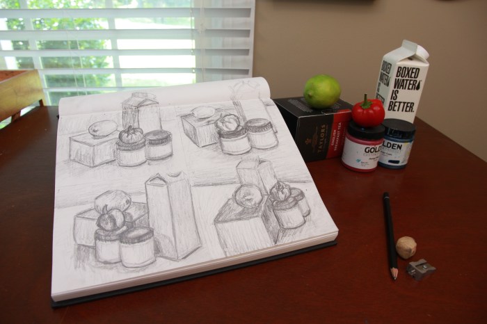
Week 4 we moved on to proportion. Our lecture focused on logos and how they are based on recognizable objects that have been simplified to their most simple forms. They are recognizable as the original object in huge part due to their proportion. Below are my initial 18 thumbnail sketches of a pepper for the assignment.


The next step was to take 3 of your most interesting thumbnails and develop them further. Below are my 3.


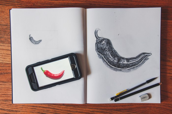
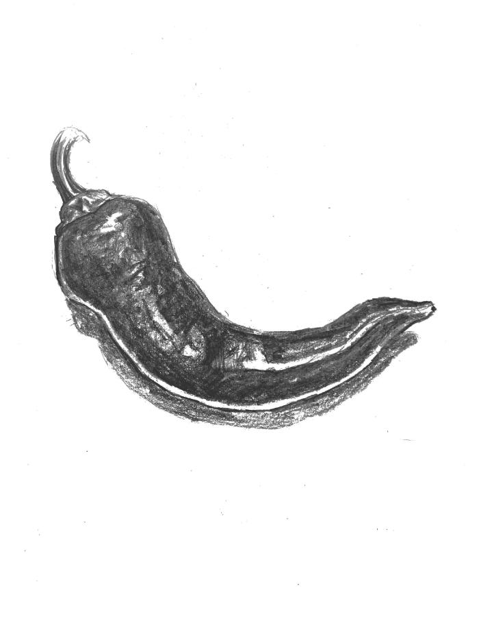
Finally, you were to take 1 sketch of the 3 refined thumbs and draw it at the scale of a standard business card, as well as that of a standard letterhead. Below are my final drawings as well as the original object.