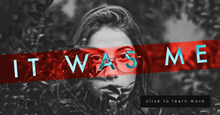
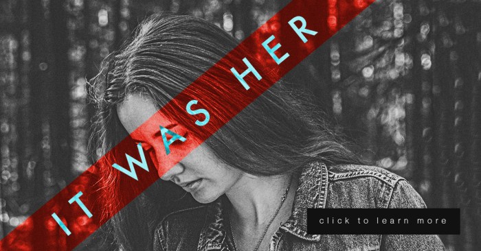
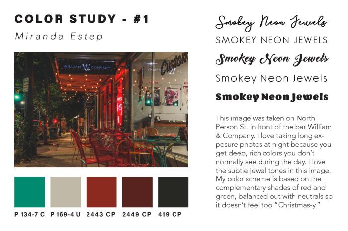
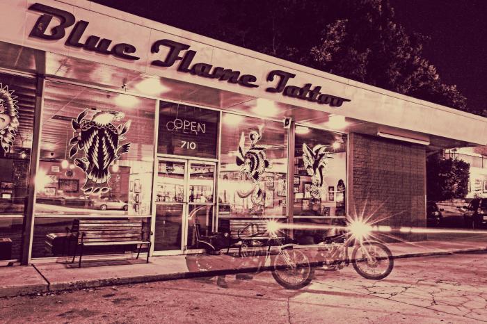
In my most recent project in Illustrative Imaging we were told to take four photos that focused on color and had a theme connecting them. I chose to take photos in the city of Raleigh, NC where I live. The theme for my photos was street photography / urban scenes. Below are the four original photos I took and chose to use for this assignment:


I thought these were the most colorful that I had taken and so would work well for this assignment. The next step was to take these photos and do color studies on them. I used the Adobe Color Wheel (you can find it here) to help me do this. After logging in with my Adobe ID on the site, I then clicked “import image” and uploaded each of the images to get a color scheme from them. The automatically chosen colors were not the best, so I had to adjust some of the points on the image where it was pulling color from until I got a result that I liked. I then clicked “save color theme” for each of the themes I created using the images, so that they would be saved as swatches in my Adobe Creative Cloud account – this way I could access them across all platforms.
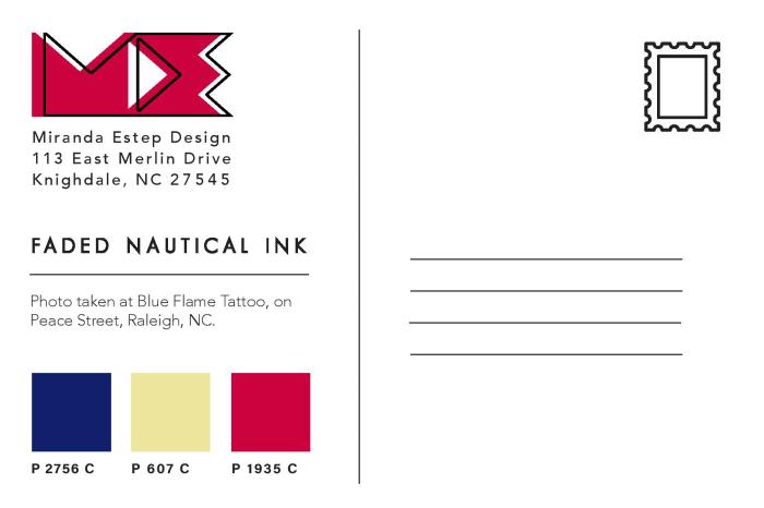
In order to find the Pantone matches of the colors I chose, I visited Pantone’s website and searched each color from my color theme’s by their “HEX” number in the Pantone search feature. By doing this I was able to find Pantone colors that most closely matched the colors I had chosen for my color themes using the Adobe Color Wheel.
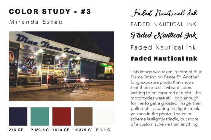
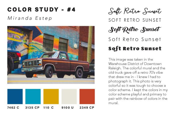
Once I had all of the Pantone names for my colors, I added them as swatches in my color study document underneath each of my photos. I then created a title for each of my images in five different fonts to see what font fit best with the image. I also wrote a description for each image, describing my concept and why I chose it. You can see the finished color study document below:

 After creating the color study for each image and assembling it into one InDesign
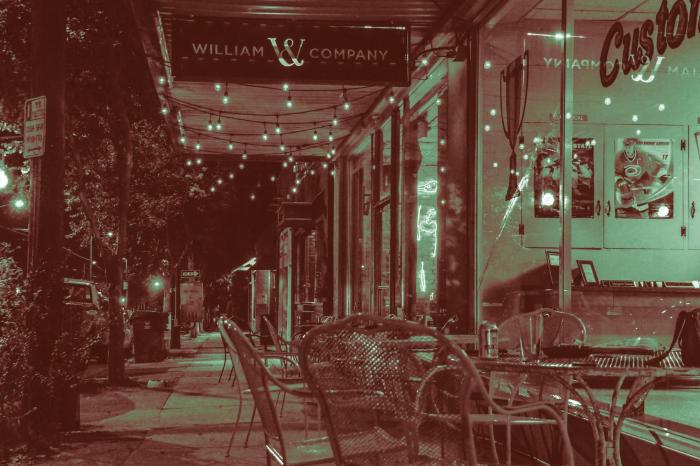
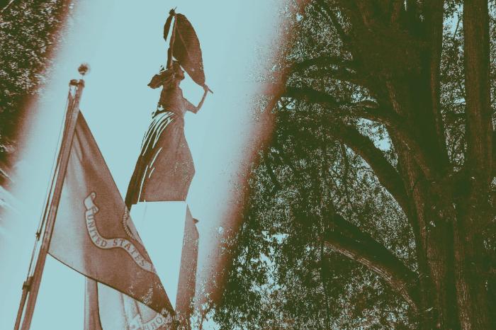
document, I then created Tritone images using my images and the Pantone swatches I chose during my color study. I used this Lynda.com video tutorial to create the tritone images. During the process I discovered that some of the original color swatches I chose were not showing up well together as a duotone or tritone image. Because of this, I chose different Pantone Coated color swatches for all of my images. I chose colors that were close to the original color swatches, but showed up clearly in the tritone image. My goal for the tritone image was to be able to distinguish each of the three color swatches individually. This way each color swatch added something to the image and was not lost to the viewer.
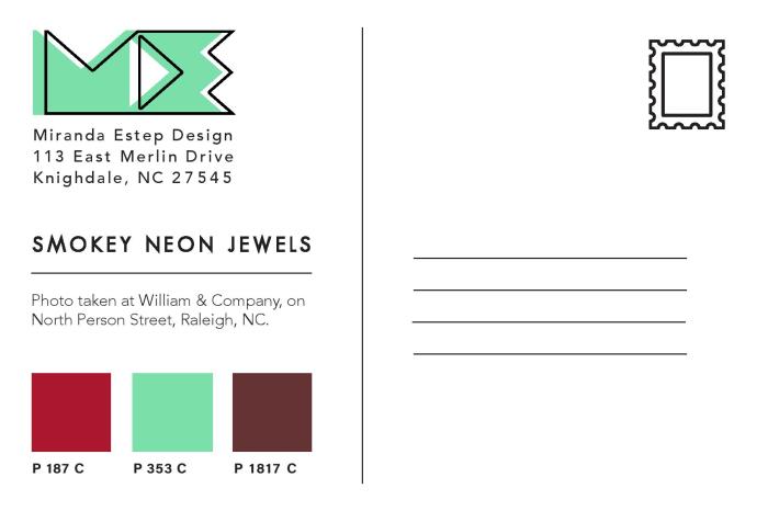
Below are all three of my final tritone images as postcard designs, featuring the three Pantone Coated swatches on the back and my personal logo, Miranda Estep Design, in the color of one of the swatches.

I really enjoyed this assignment because it challenged me as a photographer as well as a designer. I learned a lot about Pantone colors that I had not previously known and it gave me a new level of respect for Pantone. I would highly suggest any designer experiment with this assignment themselves.