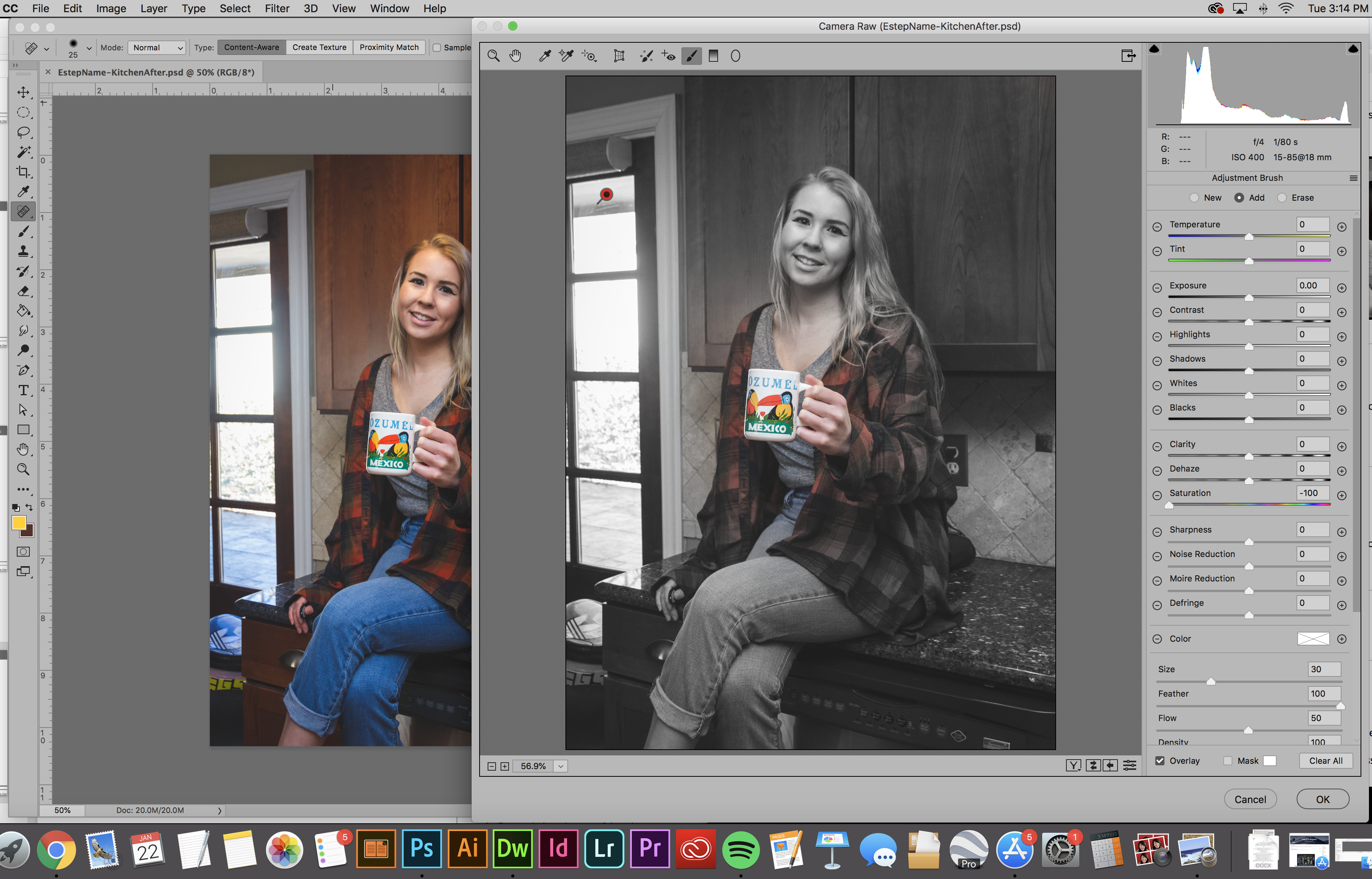
This week’s lesson in my Illustrative Imaging class was learning about masking and selections in Adobe Photoshop. I was already familiar with selections and selection tools, but not as familiar with masking. I knew layer masks were a useful, non-destructive method for photo editing, but I’d always used other work-arounds via layer copying instead of using masks because I was too lazy to practice using layer masks to get myself familiar with them. Well here was my chance: Time to learn about masking!
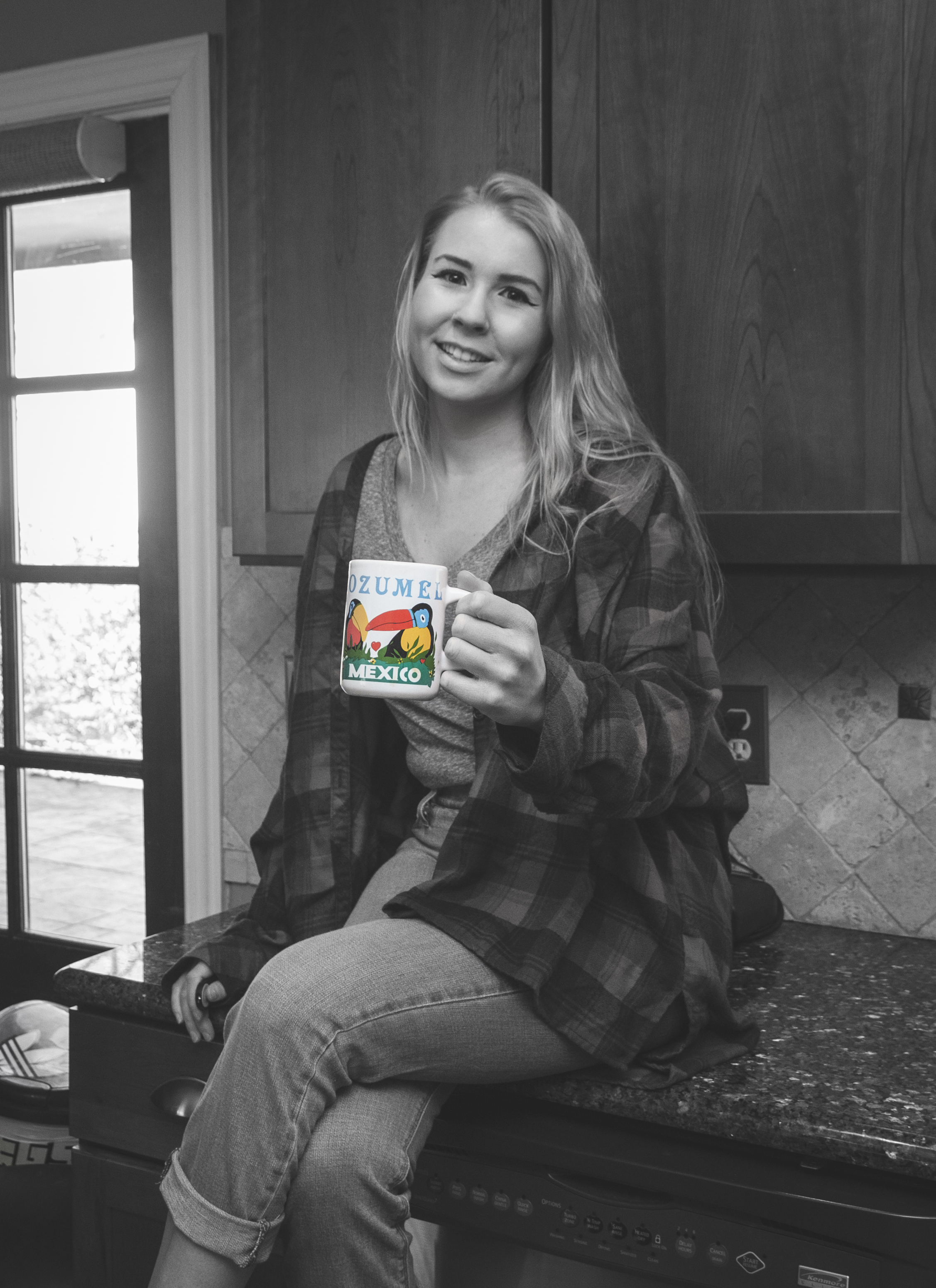
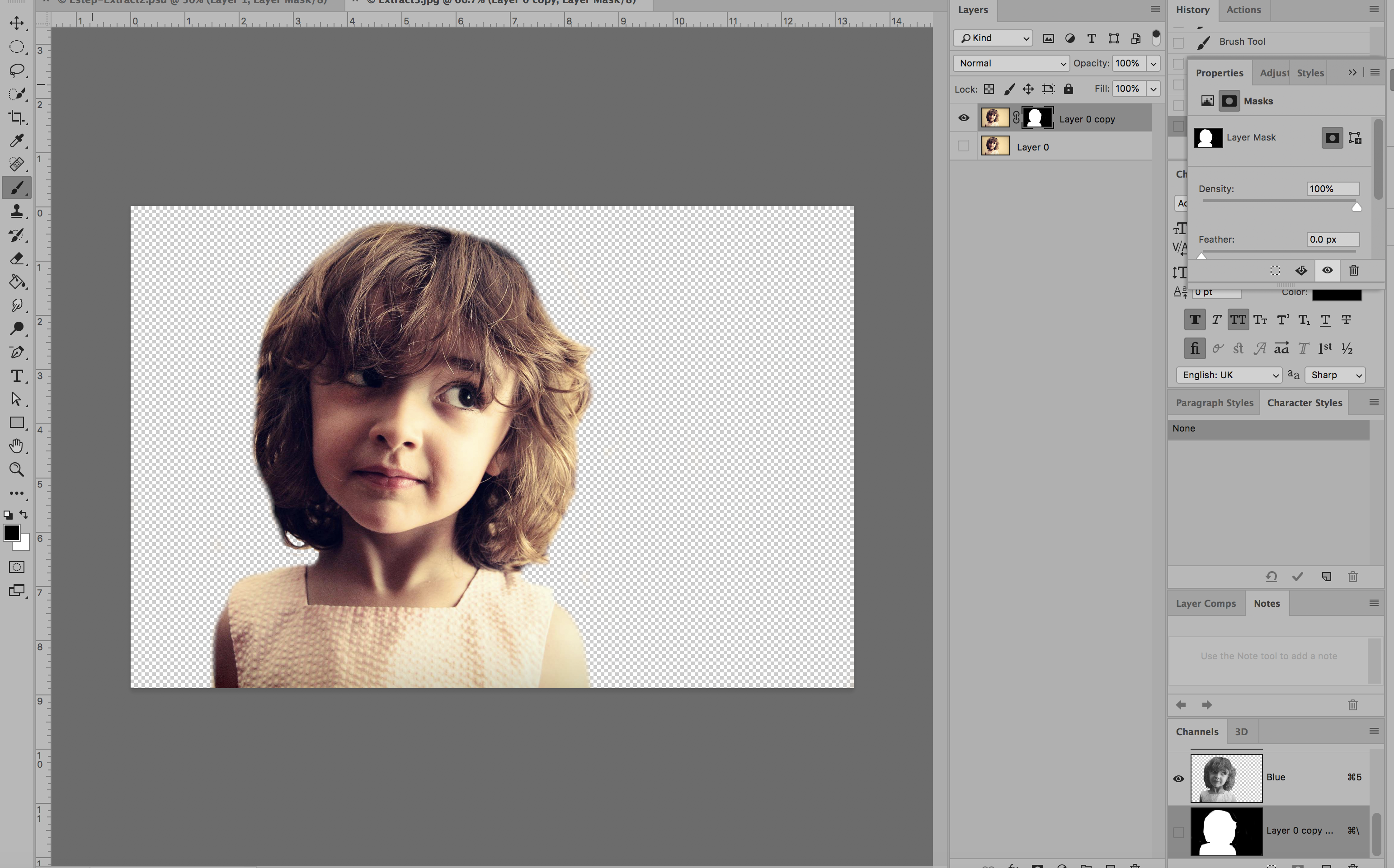
The first part of the assignment was to remove a subject in a photo from the photo’s background via masking (NOT destroying any pixels – simply making the photo to hide the background.) We had several options but I chose the image below:

Using the layer mask tool, I painted everything I wanted to remain visible WHITE and everything I wanted to disappear BLACK. Below was the result:
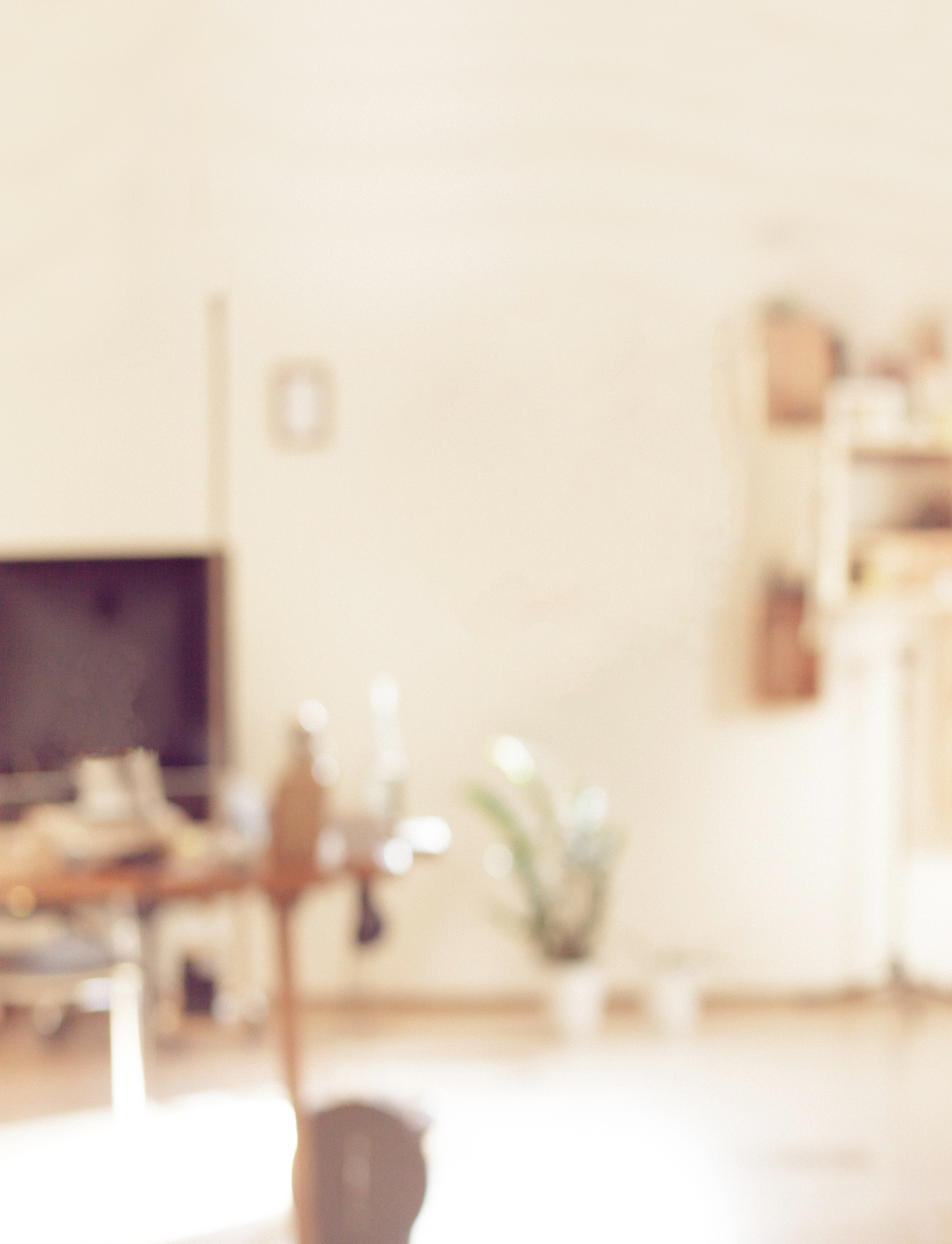
The next part of the assignment was to come up with a “pattern” or background image to go behind the subject. In order to avoid any copyright infringement, I used the Creative Commons database to search for an image that would be free for use. I found a blurred image of a room with similar colors that I though would work well with the image. Here it is below (Image source link here: https://pixabay.com/en/blur-office-background-blur-office-2926794/ ) :

I then edited the background slightly and cropped it in order to add the photo of the girl on top. Here was the edited background:
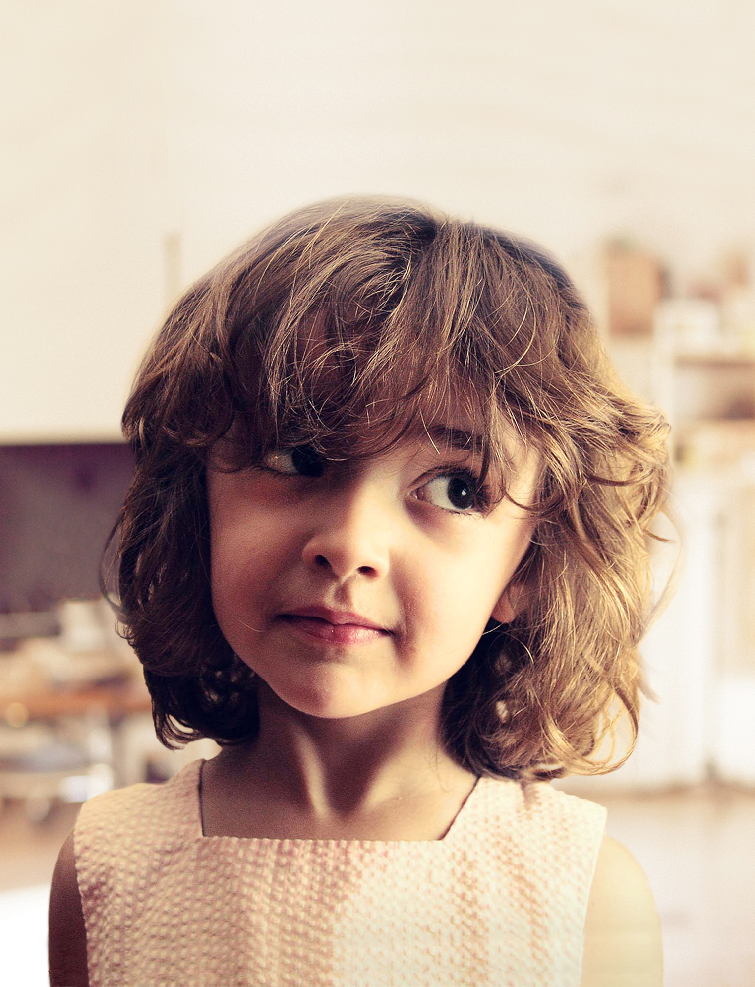
I removed the window from the background image so the bright white color would not be seen behind the girl’s head. Here’s what it looked like once I added the girl onto the background:
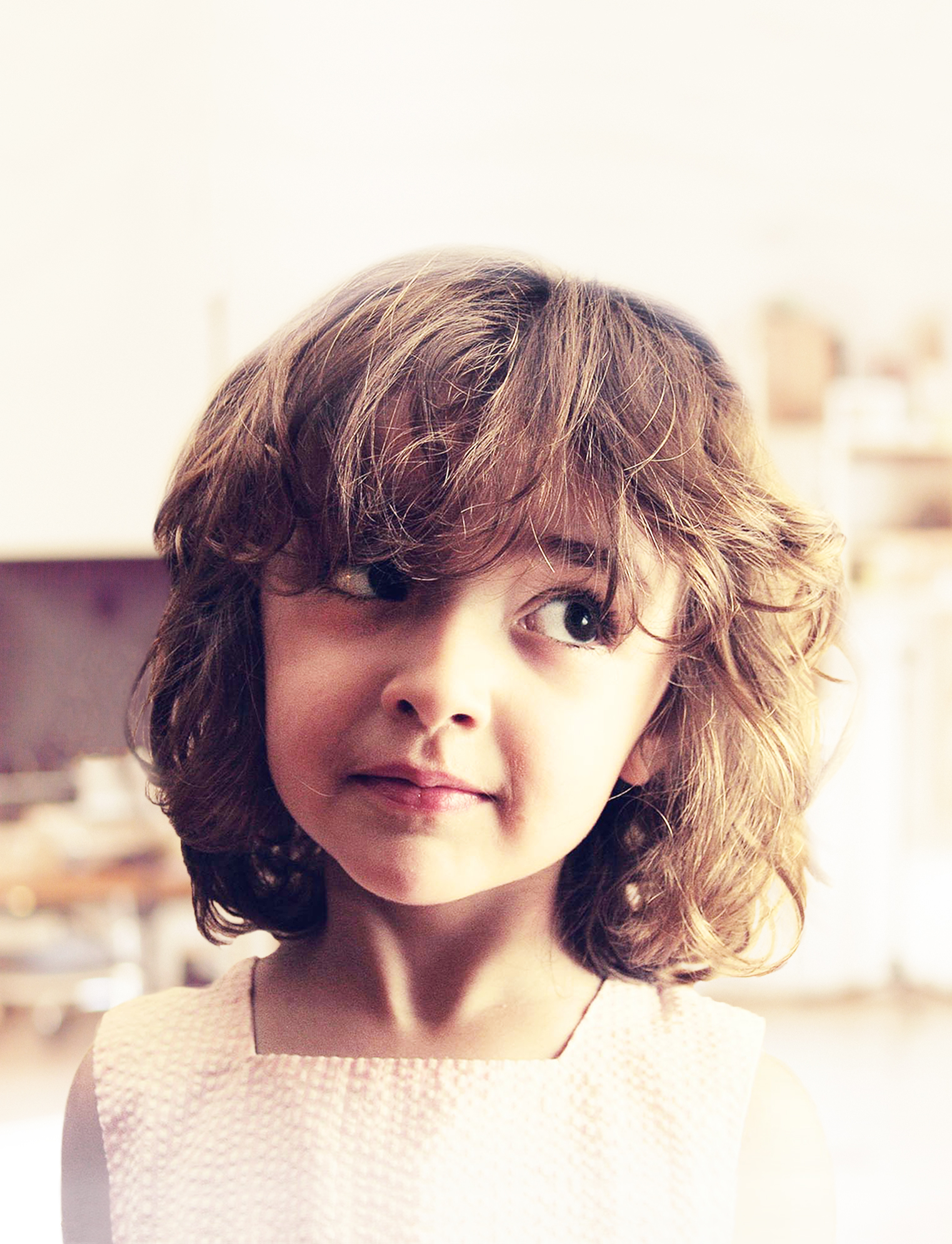
I then added two adjustment layers to edit the contrast, brightness, hue and saturation of the image. My goal was to lighten the image so that the text I would add on top would be highly visible. I also added an additional layer that I painted with the paintbrush tool (using the color white at 50% opacity) to lighten just the bottom of the image where I would add text as well. Here is the photo after two adjustment layers have been added and the paint tool was used:
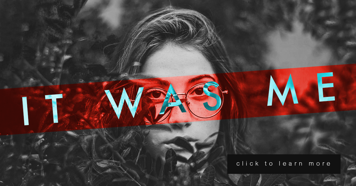
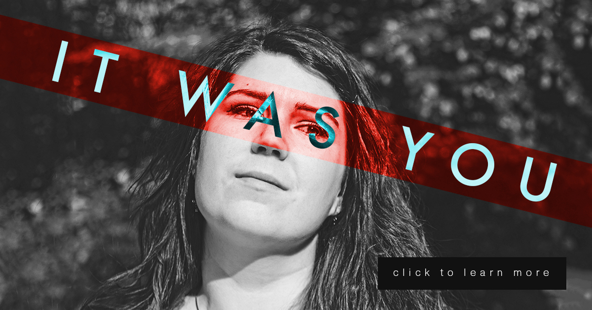
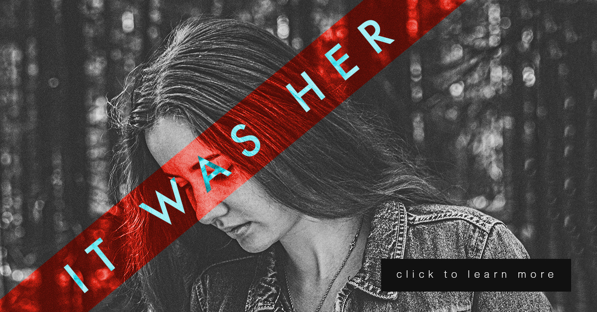
The final part of the assignment was to add text. I decided this photo looked like a child who had just gotten into some trouble and was being scolded for misbehaving. So, I decide to make this image a book cover for a parenting and child development book. Below is the book cover after I’ve added the Title/Heading, Tagline/Subheading and the author’s name:
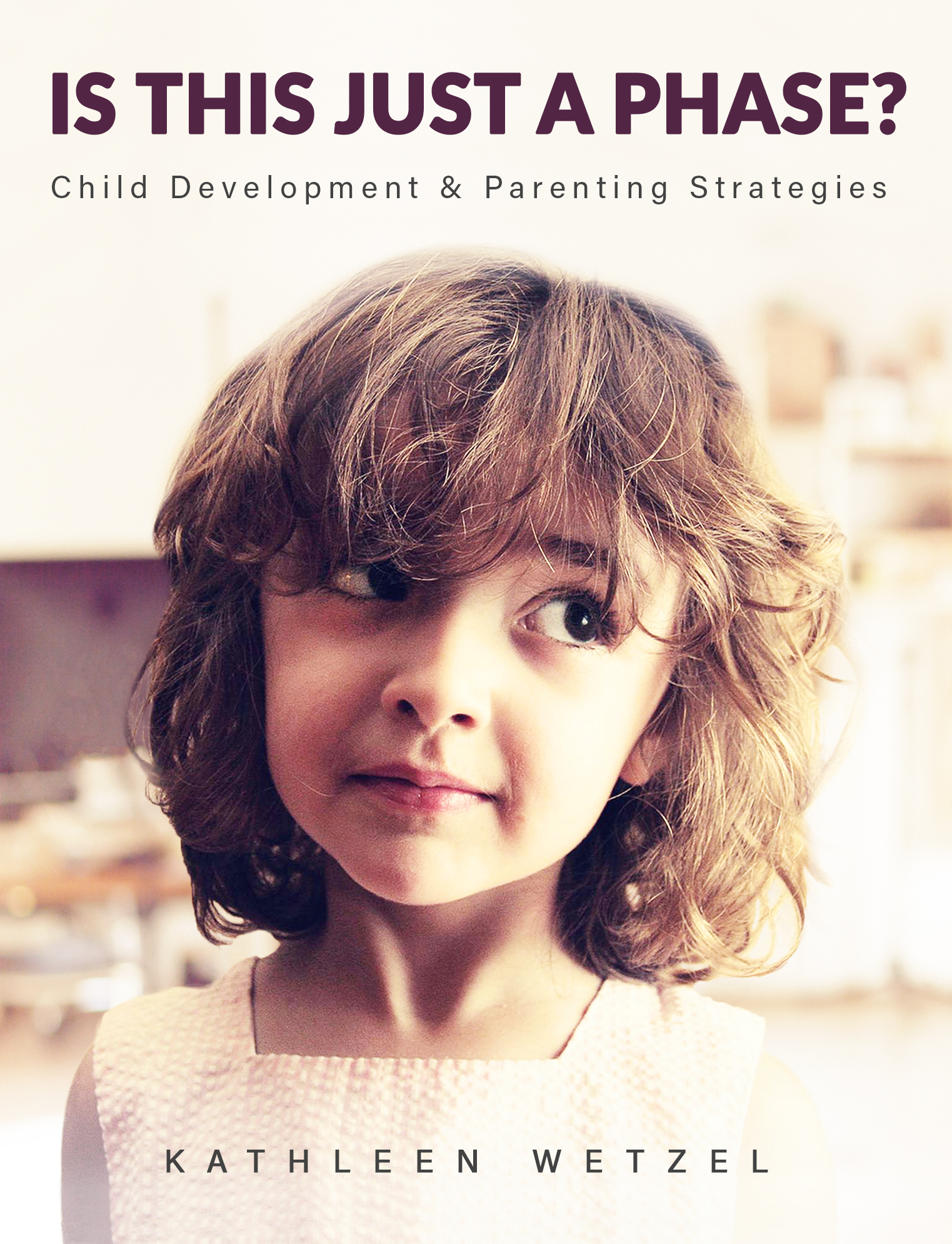
I chose to simply use the author’s name and not include the word “By” because during my research on other books of the same genre, most did not include “By” in front of the author’s name. Overall I feel I was most successful with blending the subject into the background image so that it does not look like it’s floating. If I could do it over, I would like to improve on my use of typography and how it integrated with the rest of the design. This was an interesting assignment and helped me finally understand and utilize masking. You should try it out yourself!


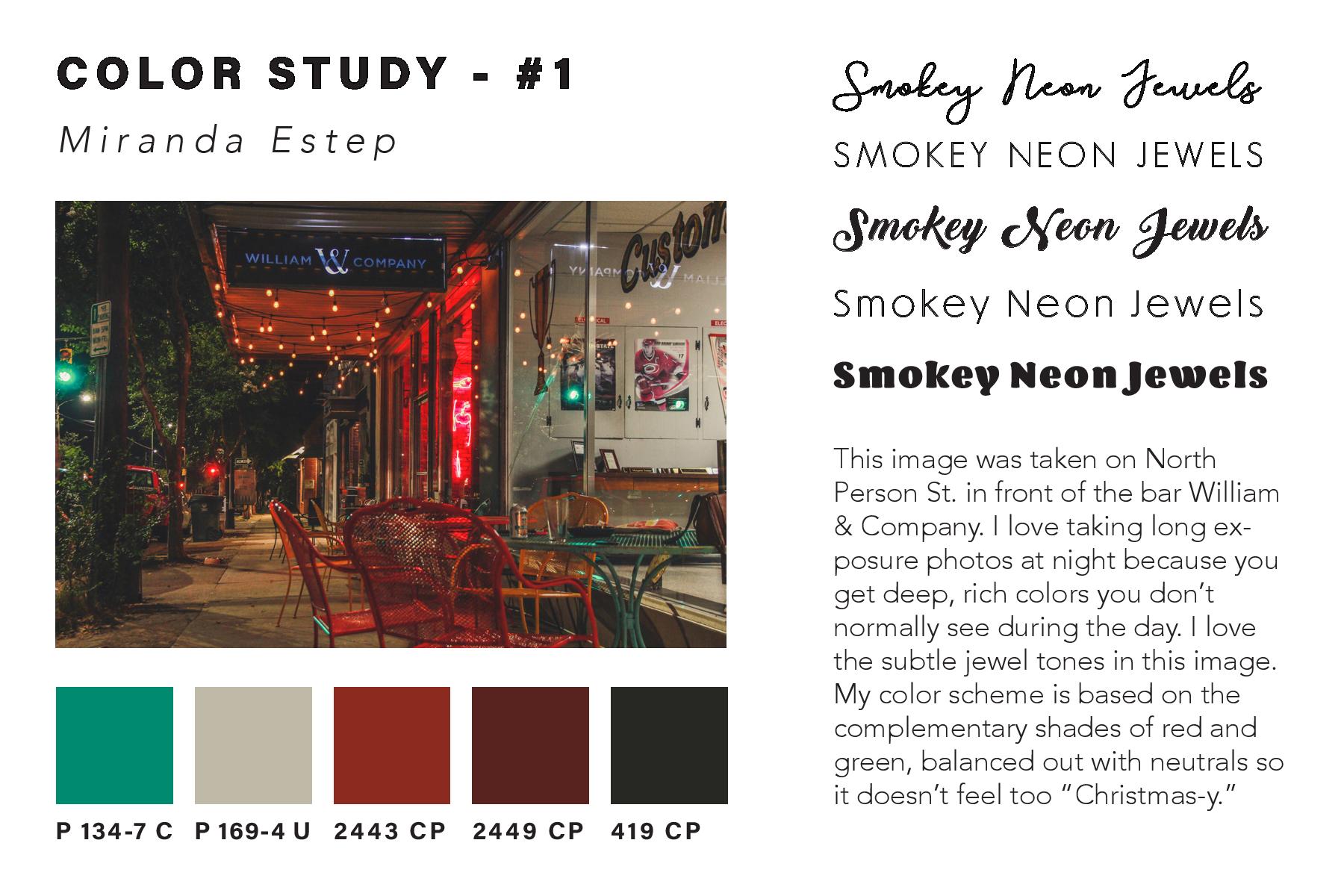
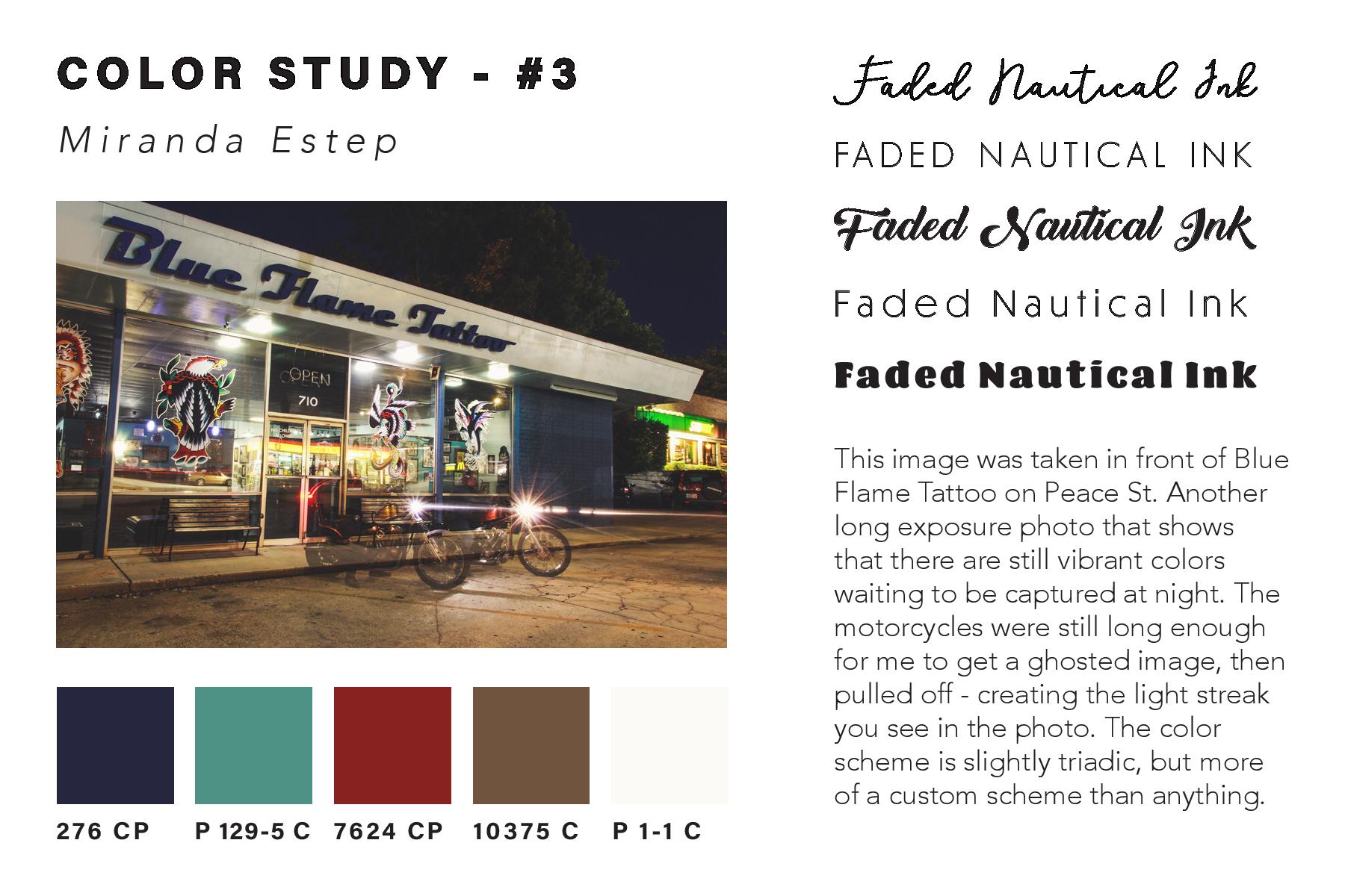
 After creating the color study for each image and assembling it into one InDesign
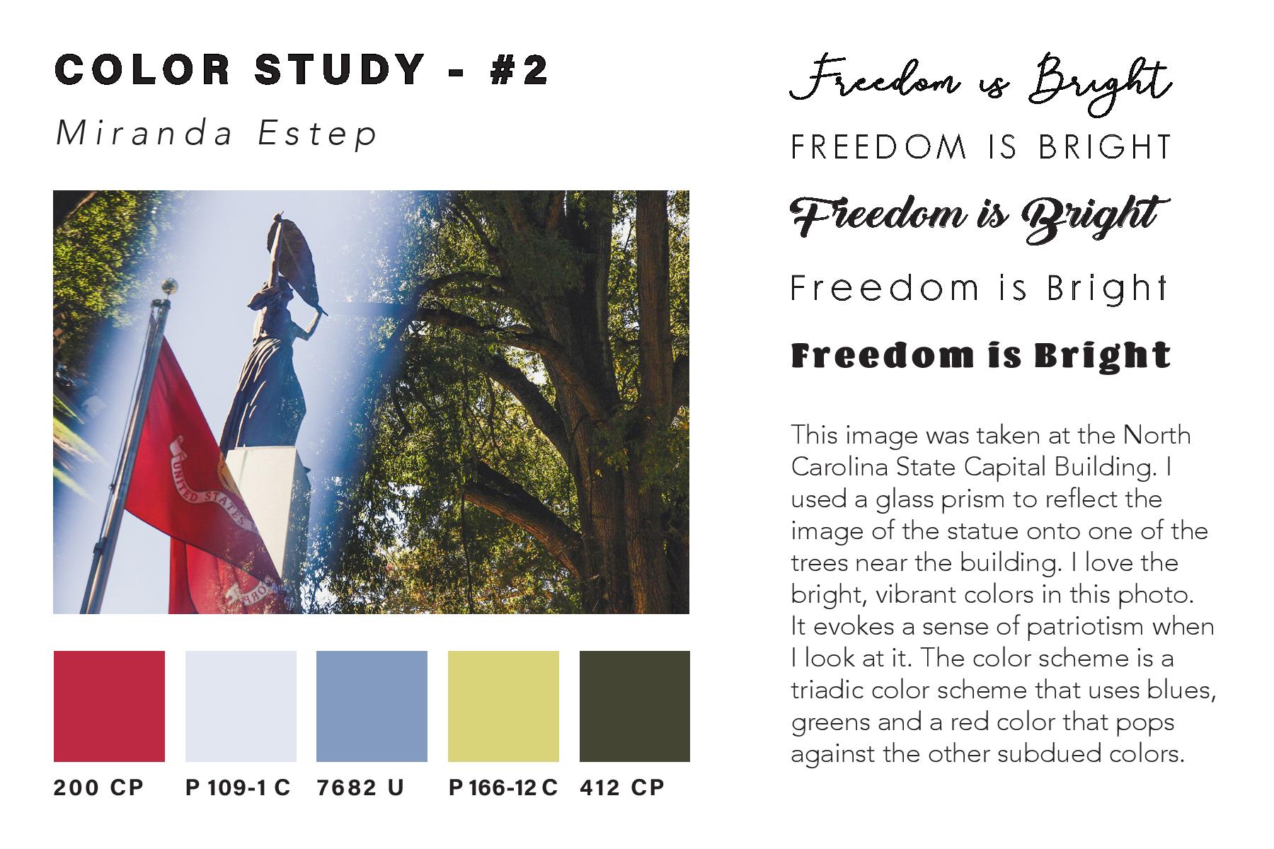
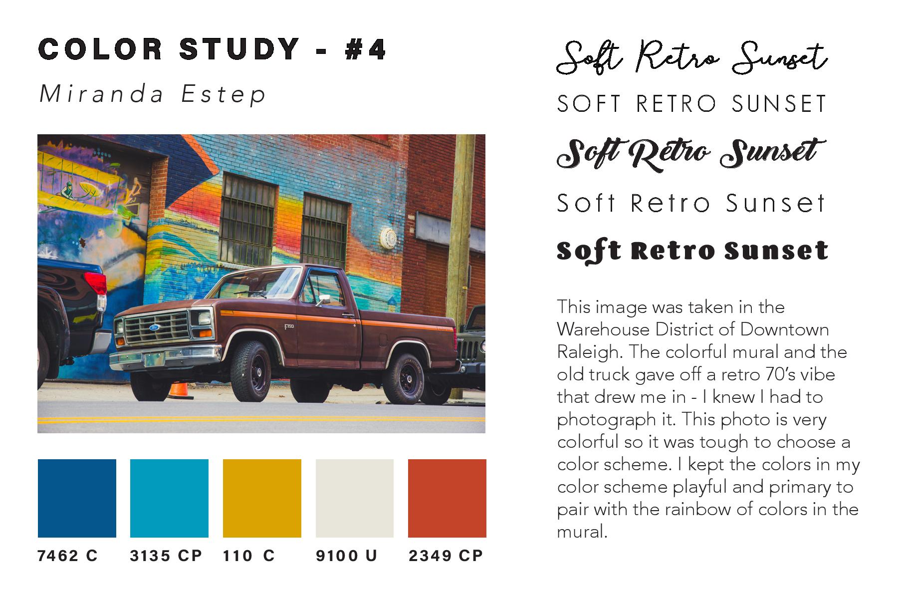