As a hobby photographer, I love learning new tips and tricks about how to improve my photography skills. I’ve seen many articles out there that cover similar topics, like this one by Zuke’s, which I really enjoyed. Zuke’s is one of my favorite dog treat & supplement companies, so I was very interested in what they had to say about pet photography.
Zuke’s talks about Lori Fusaro and how she began photographing dogs. She volunteers to photograph homeless dogs who are up for adoption to increase their chances of finding a home – an AMAZING undertaking on her part.
A lot of people don’t know that most animal rescue organizations do not have the time or funds to hire professional photographers to photograph the animals in their care. Many dogs listed for adoption online have dark, blurry, pixelated photos – or no photos at all.
Lori’s story is inspirational and should encourage all of you to offer your help to your local animal rescue. Lori’s photography tips are all useful as well (see them here) but I have a few more to add myself.
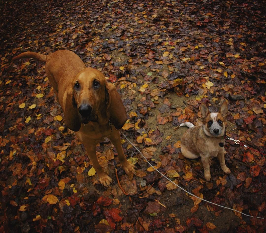
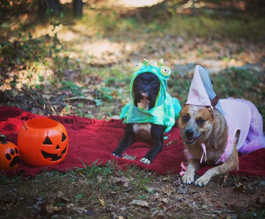
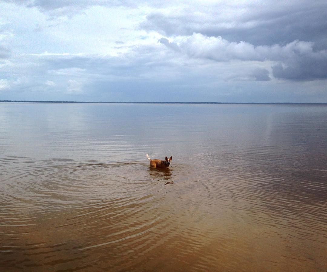
1. Photograph your dogs outdoors. Outdoor shots can provide dynamic results.
2. Photograph during the “golden hour” – the hour or two before sunset that provides a diffused, “golden” light which is ideal for photos.
3. Make sure your shutter speed isn’t too slow. Dogs move fast and you don’t want blurry pictures.
4. Take your dogs leash off – with editing! Set your fears at ease by simply editing your dog’s leash out of pictures with the “heal” or “clone” tool during the editing process. (You can also edit off their collar.)
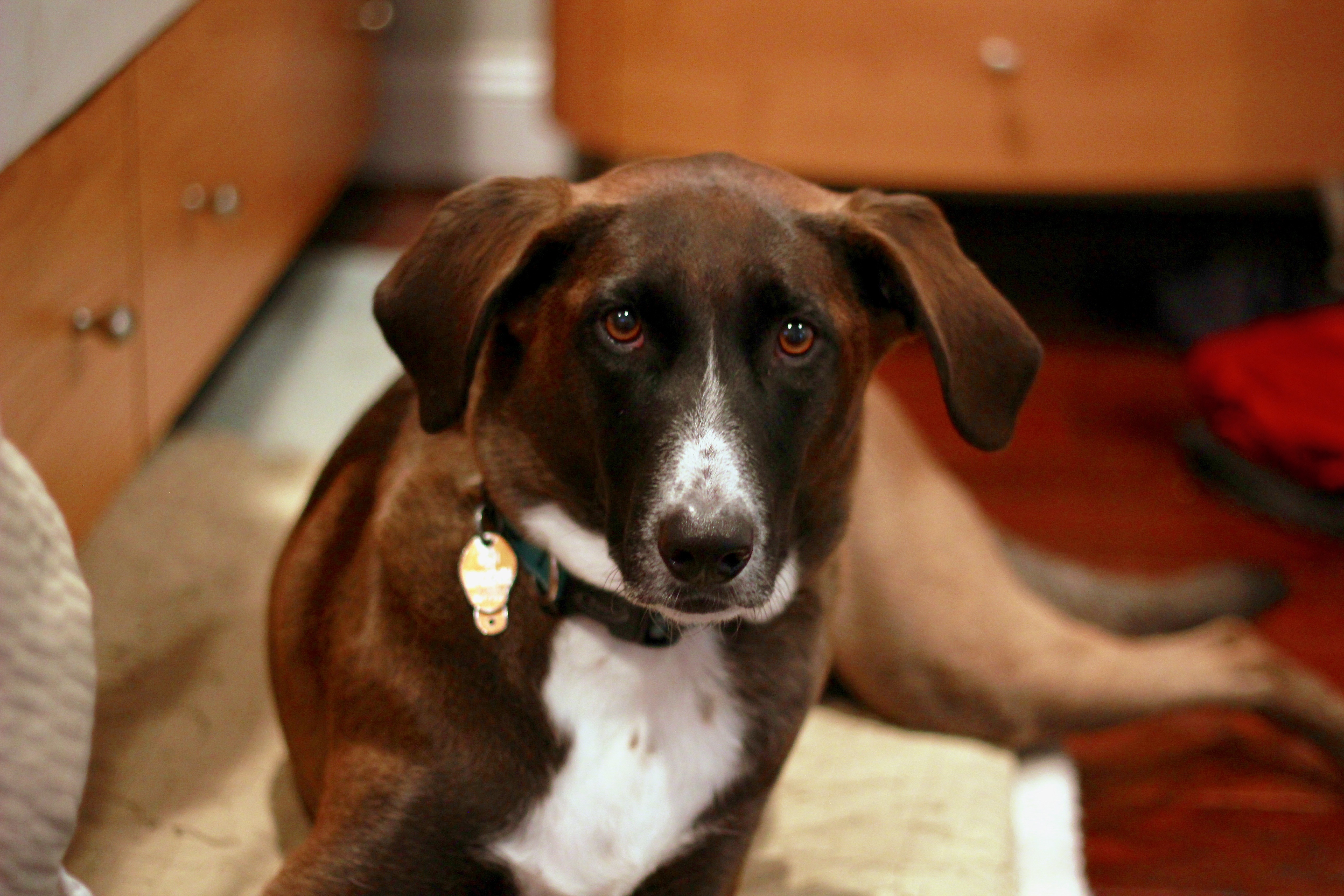
5. Focus on the eyes. Make sure your dog’s eyes are in focus in close up shots and brighten them during the editing process afterwards.
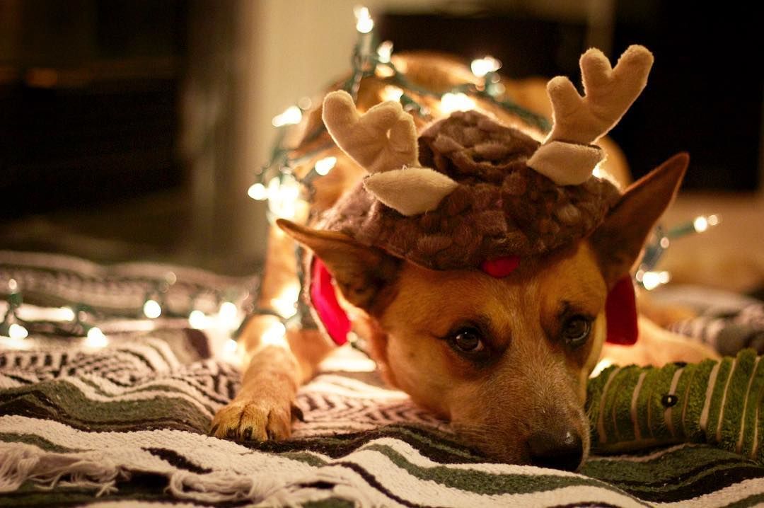
6. Use props. Most good photographers already know this – but don’t be afraid to experiment. Have your pup hold an object in it’s mouth, like a branch, flower or other object related to the scene they’re in.
7. Squeak at your dog! If you feel like you’re losing your dogs attention (treats and toys aren’t cutting it ) make the weirdest high-pitched noises you can think of. It works – I promise.
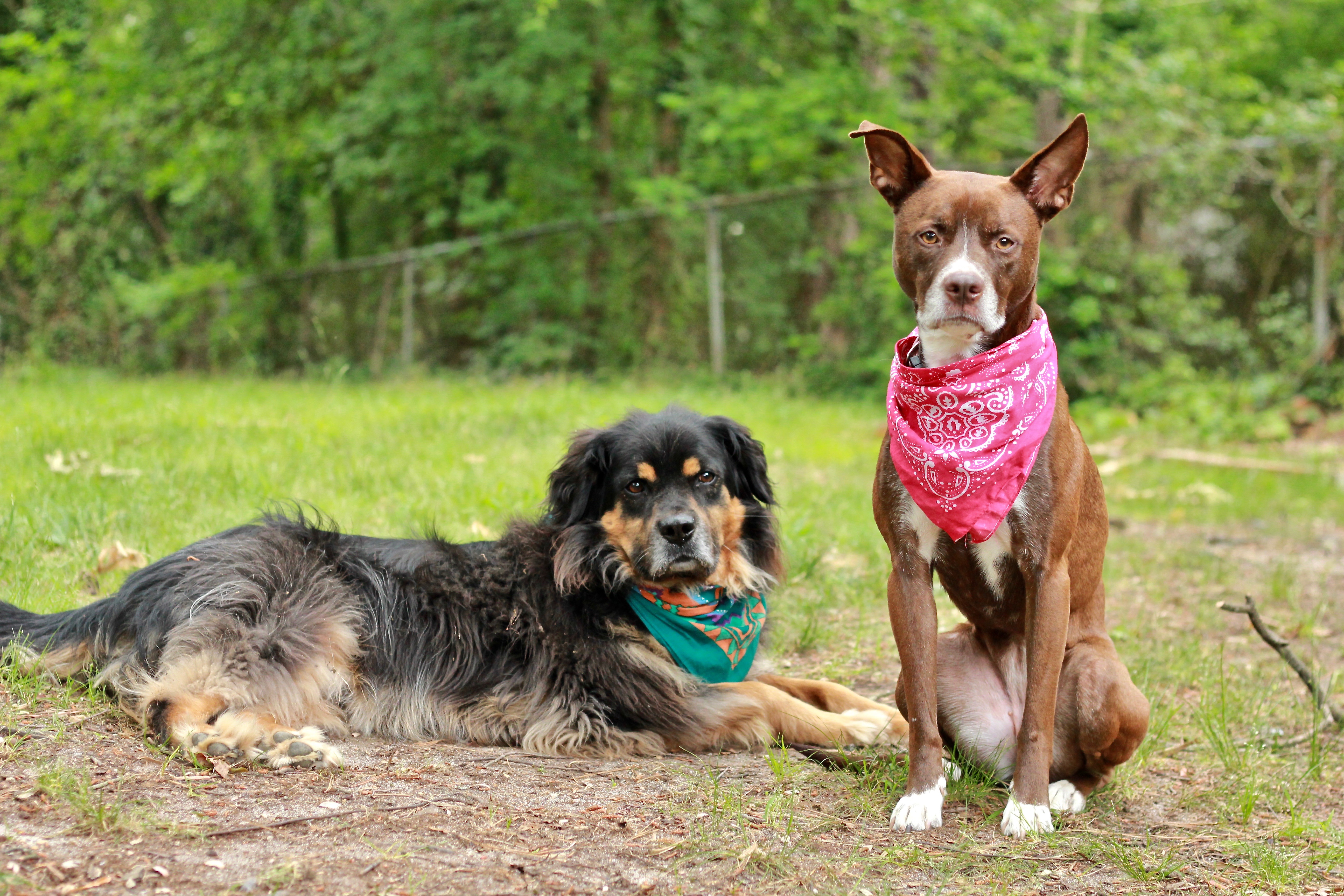
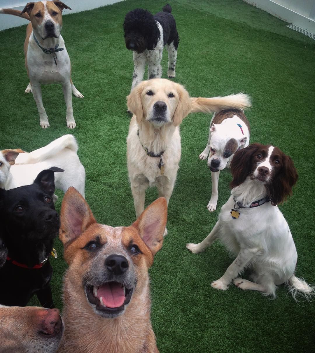
8. Have a playdate. Photos with multiple dogs provides great variety if your solo shots are getting stale. Try visiting a dog park or hang out with a friend that has a dog.
There are MANY more tips out there, but the most important thing to remember is to do what works best for you, your camera and your dog – so get out there and start shooting!
If you have any questions about photography, dogs or anything else, be sure to leave a comment below and I’ll get back to you. If this post helped spark some new ideas with my fellow dog photographers out there – be sure to share it.
Thanks,
Miranda Estep
Continue reading "8 Tips for Improving Dog Photography" →


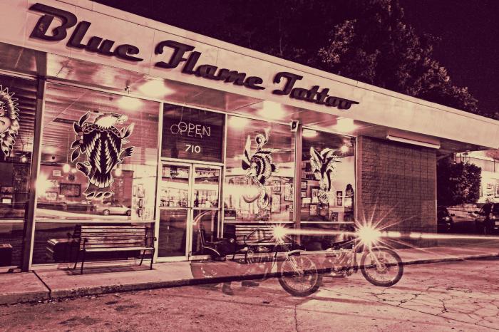


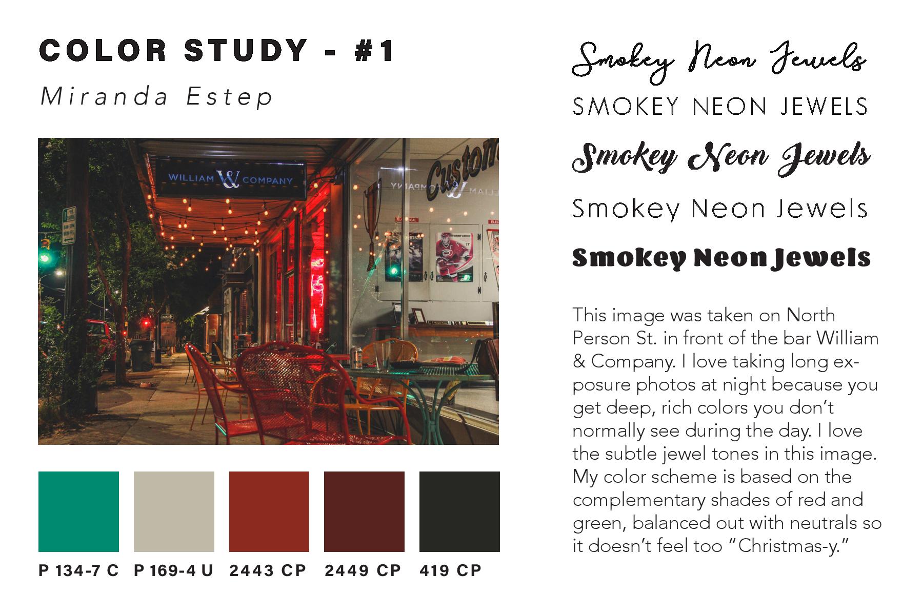
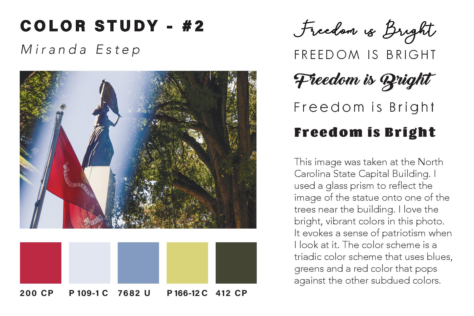
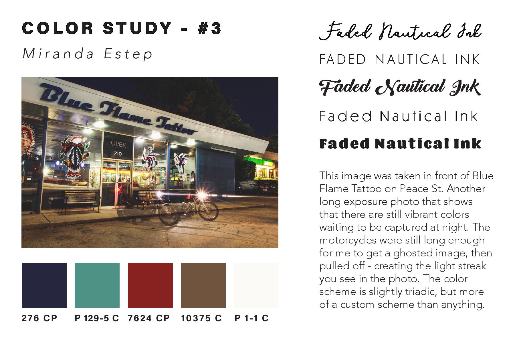
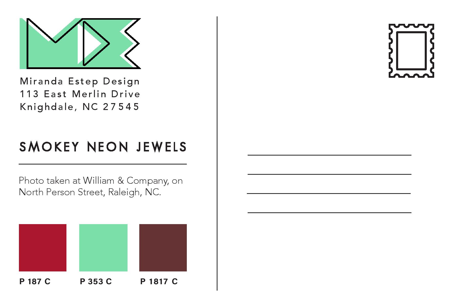
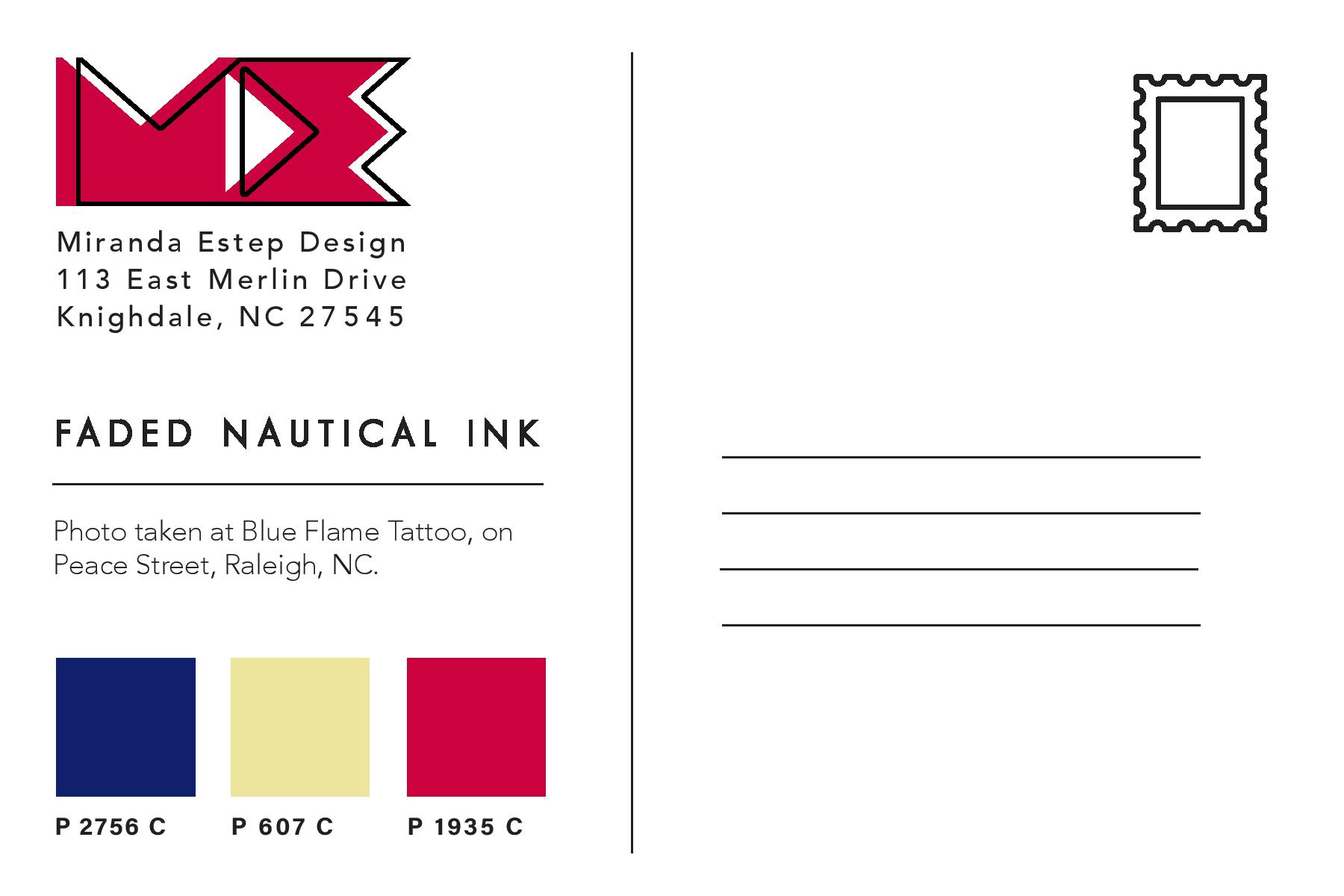
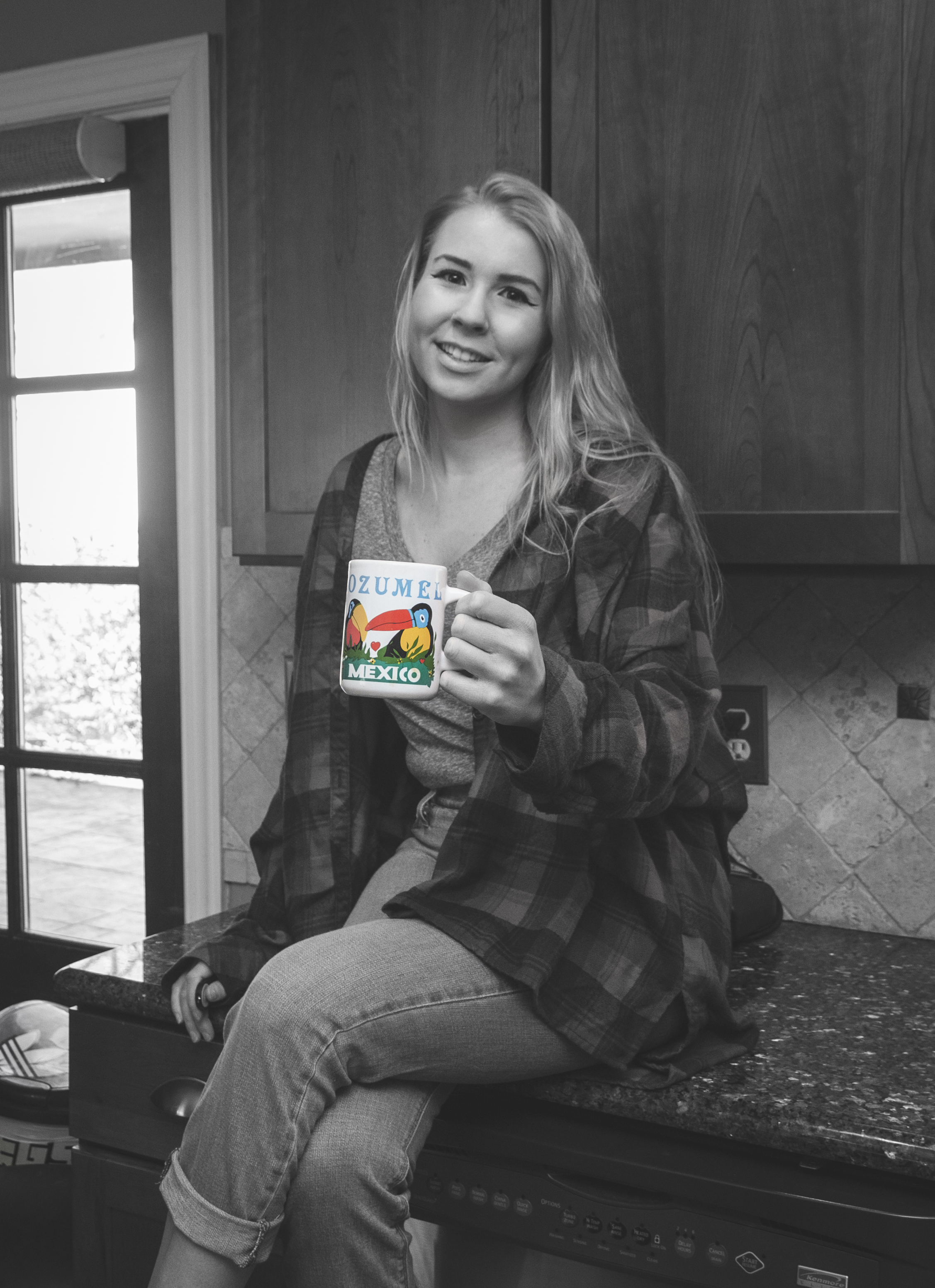
 After creating the color study for each image and assembling it into one InDesign