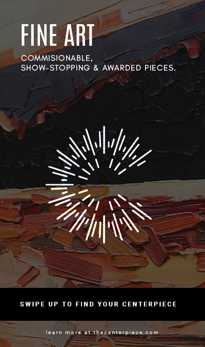
My concept was to create web ads for the three main categories of The Centerpiece fine art gallery. Fine Art, Framing and Art Workshops. The phrase “Find your Centerpiece” was meant to be a bit vague to entice the viewer to click/swipe up/visit the link in bio to learn more. “Find your Centerpiece” also refers to finding the perfect piece for a person’s home, framing the perfect piece or creating the perfect piece in a workshop. I wanted to keep things simple, flat and clean like I always do. I was really stuck on this project and didn’t want to make it too simplistic but also didn’t want to make it overly complex and cheesy. I posted my first three rough drafts on the collab forum and got some good feedback to work from. Here were my first three versions:
My sizes were a 1×1 Tile (Instagram Post) 450 x 450, Wide Skyscaper (Sid Banner Web Ad) 160×600, Full Page Portrait (Instagram Story/Facebook Story) 450×675.
I took the advice of my fellow students and edited my designs accordingly. Here are my updated designs.
I left the framing ad the same and slightly changed the other ads to make them darker based on feedback.
Overall this project was very challenging but was fun because it had real-life applications to my job.
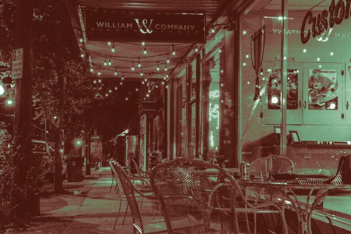
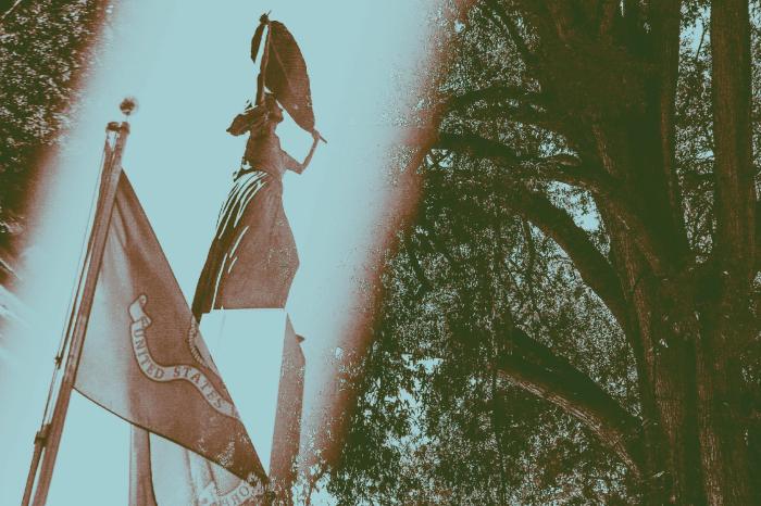
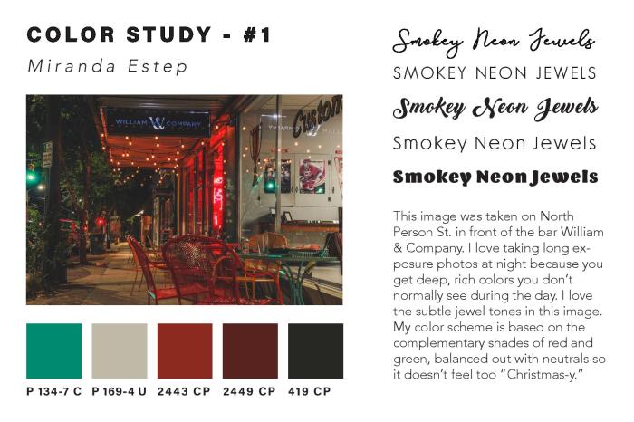
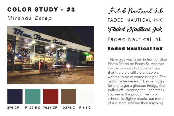
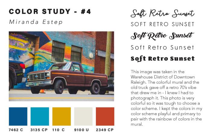
In my most recent project in Illustrative Imaging we were told to take four photos that focused on color and had a theme connecting them. I chose to take photos in the city of Raleigh, NC where I live. The theme for my photos was street photography / urban scenes. Below are the four original photos I took and chose to use for this assignment:
I thought these were the most colorful that I had taken and so would work well for this assignment. The next step was to take these photos and do color studies on them. I used the Adobe Color Wheel (you can find it here) to help me do this. After logging in with my Adobe ID on the site, I then clicked “import image” and uploaded each of the images to get a color scheme from them. The automatically chosen colors were not the best, so I had to adjust some of the points on the image where it was pulling color from until I got a result that I liked. I then clicked “save color theme” for each of the themes I created using the images, so that they would be saved as swatches in my Adobe Creative Cloud account – this way I could access them across all platforms.
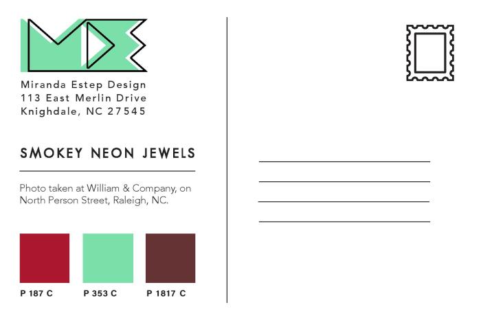
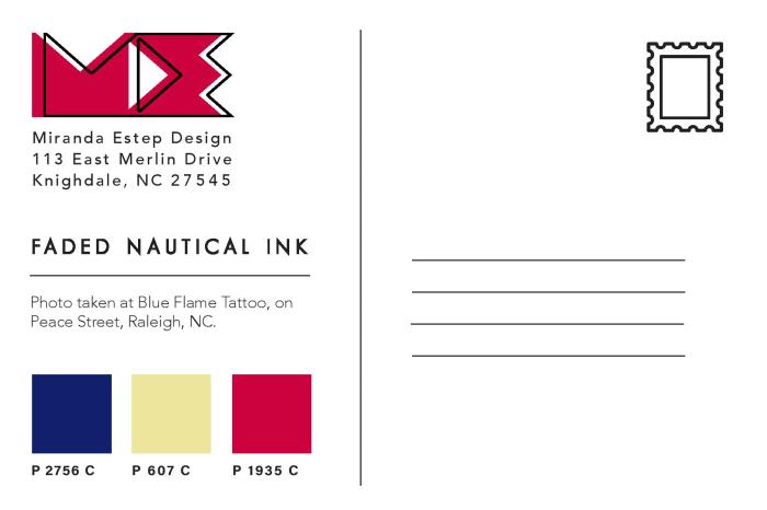
In order to find the Pantone matches of the colors I chose, I visited Pantone’s website and searched each color from my color theme’s by their “HEX” number in the Pantone search feature. By doing this I was able to find Pantone colors that most closely matched the colors I had chosen for my color themes using the Adobe Color Wheel.
Once I had all of the Pantone names for my colors, I added them as swatches in my color study document underneath each of my photos. I then created a title for each of my images in five different fonts to see what font fit best with the image. I also wrote a description for each image, describing my concept and why I chose it. You can see the finished color study document below:
After creating the color study for each image and assembling it into one InDesign
document, I then created Tritone images using my images and the Pantone swatches I chose during my color study. I used this Lynda.com video tutorial to create the tritone images. During the process I discovered that some of the original color swatches I chose were not showing up well together as a duotone or tritone image. Because of this, I chose different Pantone Coated color swatches for all of my images. I chose colors that were close to the original color swatches, but showed up clearly in the tritone image. My goal for the tritone image was to be able to distinguish each of the three color swatches individually. This way each color swatch added something to the image and was not lost to the viewer.
Below are all three of my final tritone images as postcard designs, featuring the three Pantone Coated swatches on the back and my personal logo, Miranda Estep Design, in the color of one of the swatches.
I really enjoyed this assignment because it challenged me as a photographer as well as a designer. I learned a lot about Pantone colors that I had not previously known and it gave me a new level of respect for Pantone. I would highly suggest any designer experiment with this assignment themselves.
This week’s lesson in my Illustrative Imaging class was learning about masking and selections in Adobe Photoshop. I was already familiar with selections and selection tools, but not as familiar with masking. I knew layer masks were a useful, non-destructive method for photo editing, but I’d always used other work-arounds via layer copying instead of using masks because I was too lazy to practice using layer masks to get myself familiar with them. Well here was my chance: Time to learn about masking!
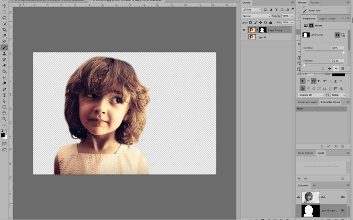
The first part of the assignment was to remove a subject in a photo from the photo’s background via masking (NOT destroying any pixels – simply making the photo to hide the background.) We had several options but I chose the image below:
Using the layer mask tool, I painted everything I wanted to remain visible WHITE and everything I wanted to disappear BLACK. Below was the result:
The next part of the assignment was to come up with a “pattern” or background image to go behind the subject. In order to avoid any copyright infringement, I used the Creative Commons database to search for an image that would be free for use. I found a blurred image of a room with similar colors that I though would work well with the image. Here it is below (Image source link here: https://pixabay.com/en/blur-office-background-blur-office-2926794/ ) :
I then edited the background slightly and cropped it in order to add the photo of the girl on top. Here was the edited background:
I removed the window from the background image so the bright white color would not be seen behind the girl’s head. Here’s what it looked like once I added the girl onto the background:
I then added two adjustment layers to edit the contrast, brightness, hue and saturation of the image. My goal was to lighten the image so that the text I would add on top would be highly visible. I also added an additional layer that I painted with the paintbrush tool (using the color white at 50% opacity) to lighten just the bottom of the image where I would add text as well. Here is the photo after two adjustment layers have been added and the paint tool was used:
The final part of the assignment was to add text. I decided this photo looked like a child who had just gotten into some trouble and was being scolded for misbehaving. So, I decide to make this image a book cover for a parenting and child development book. Below is the book cover after I’ve added the Title/Heading, Tagline/Subheading and the author’s name:
I chose to simply use the author’s name and not include the word “By” because during my research on other books of the same genre, most did not include “By” in front of the author’s name. Overall I feel I was most successful with blending the subject into the background image so that it does not look like it’s floating. If I could do it over, I would like to improve on my use of typography and how it integrated with the rest of the design. This was an interesting assignment and helped me finally understand and utilize masking. You should try it out yourself!
You may not know Chana Lynn, but I’m sure you know her blog – RaleighWhatsUp. Chana’s blog is a trusted source of all things Raleigh – what to do, where to go and most importantly – who has the best eats!
Chana has lived in Raleigh for the past 16 years, so you know she’s an expert on the subject. I first stumbled onto her blog a few months ago when a friend of mine showed me the RaleighWhatsUp Instagram. Since then I always check Chana’s blog or Instagram whenever I’m searching for something new to do in my home city.
Because of her established authority of all things Raleigh on social media, I decided to make Chana the focus of an an assignment for my Social Media class. I sent her a few questions and she kindly obliged me – her answers are below.
What Social Media channels do you use related to your interest?
I use the following on a regular basis: Instagram (My favorite!), Twitter, Facebook, Pinterest, Blogger, Offline (local App), Cureat (another local App), Swarm and Untappd.
How much time do you spend each week on this Social Media Marketing?
That’s hard to say, I try to post or share on social 1-3x a day to IG/Twitter and post a blog update 1-3x a month. I guess per week its probably 5 hours or so a week. More if I’m doing more specific blog posts as an influencer or sharing an event that I’ve attended which could add 5-10 hours.
How do you engage visitors to participate and share their content?
I try to engage visitors by sharing/posting things that are current/relevant, something unique or new that they may not have known about around Raleigh or places we visit. I try to make the posts visually interesting to get them to stop and read and engage. Sometimes I might ask a question, often I will respond to questions and comments posted on my social. I often find that visitors/followers will tag their friends and family to make them aware of restaurants, shops, new openings in Raleigh and the Triangle, etc.
How does this social media engagement benefit you?
I love hearing from followers that they go to RaleighWhatsUp to find out where to eat, dine, shop, etc. I love getting local Raleigh people to spend time in their local coffee shops, restaurants, breweries, boutiques etc and support their local business owners. I think being authentic and real helps to grow a local organic following and this in turn opens up work opportunities for me to do social media or website design for businesses, as well as opportunities to partner with local businesses or be a local influencer for different brands/hotels, etc.
How does this social media engagement benefit your audience?
I hope that it benefits my audience by highlighting all the great things about their city and helps them find out more about things they are interested in whether its art, food, drink, architecture, shopping, travel and more. I think people enjoy being in the know, especially about where they live. I hope it gets people out exploring and engaging with friends in cool places in and around Raleigh. Life is about experiences and the more people are out supporting small businesses and having great experiences the more exciting and better off Raleigh will be!
As you can see, Chana is well versed in social media and uses it to tell the story of the beautiful city of Raleigh, NC and it’s people. If you haven’t checked out RaleighWhatsUp, you’re missing out – Click here to view Chana’s blog.
Since discovering RaleighWhatsUp I’ve fallen even further in love with Raleigh and the surrounding area – Thanks Chana!
Comment below if you love the city of oaks & answer this: What do you think Raleigh needs more of?


 After creating the color study for each image and assembling it into one InDesign