Hello, I'm Miranda! I'm a graphic designer with a knack for marketing. I have a background in photography and illustration which allows me to create engaging content for email, social media and event marketing. Contact me if you’d like to work together. Thanks!
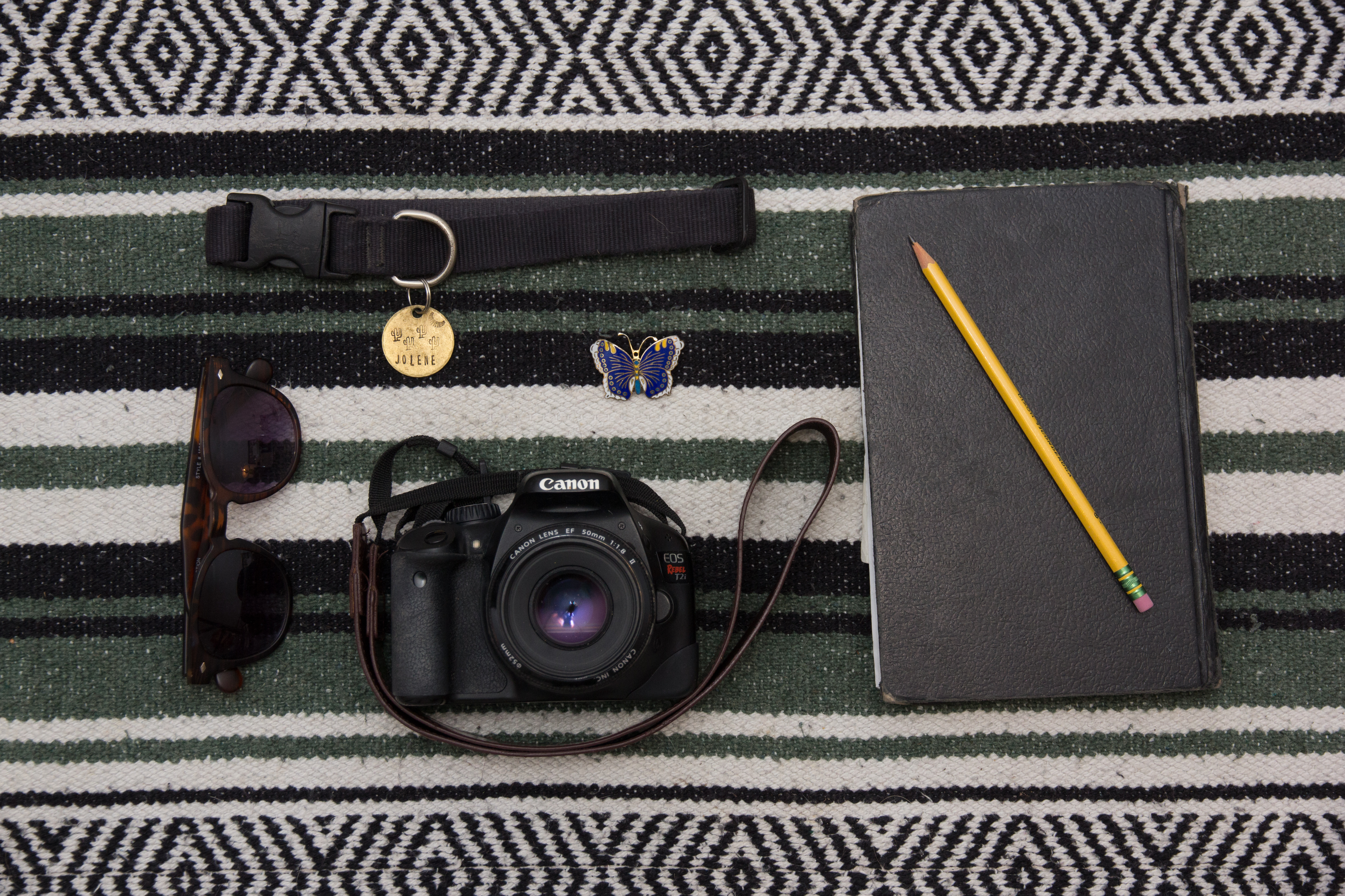
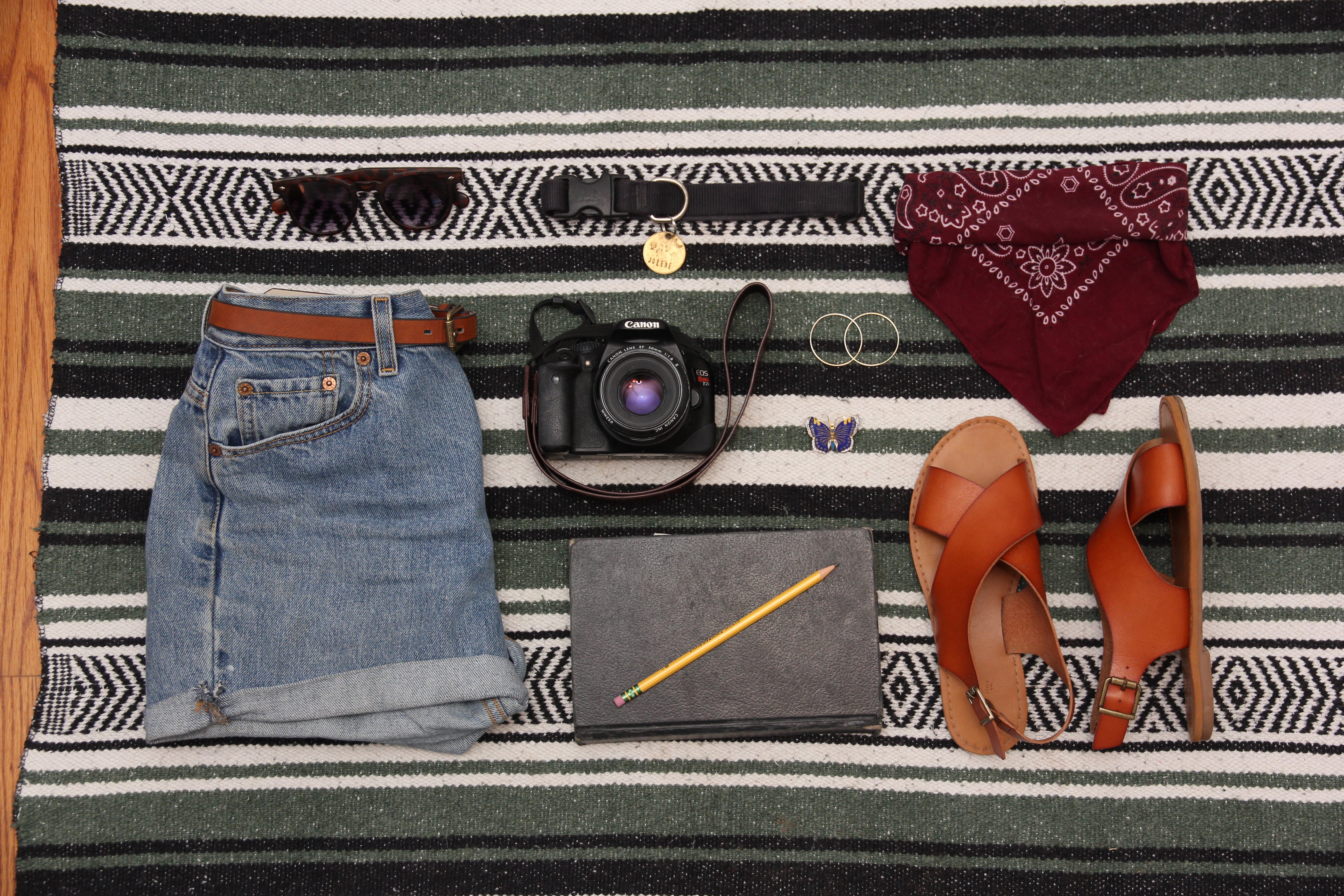
This week we were assigned to take images of objects that represented us. We were to shoot a group of 5 objects, 9 objects and 13 objects. Below are my three image options, unedited and uncropped.
Image 1:
Image 2:
Image 3 (Please note I will use content aware to fix this image so that it is not cropping the shirt out):
I look forward to hearing feedback from my peers!
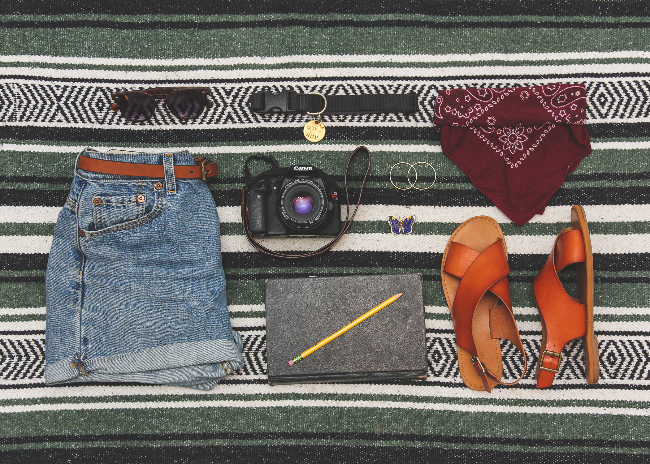
Continuing last week’s project in which I took “knolling,” or overhead, grid-layout, photos of meaningful objects, I had to chose a final photo to work with. After posting my three photos, my peers decided my image with 9 objects was the strongest so I chose that one to continue the project with. Below is my final photo:
For the next part of the project, we were to take the image and add our name as a title, as well as a subtitle describing the image’s concept.
Below is my final image:
In the final image I used the liquify tool to straighten some of the blanket stripes so the text fit in the lines better and I also added a gradient overlay to help the text stand out from the background. I hope you like the final result!
My concept was to create web ads for the three main categories of The Centerpiece fine art gallery. Fine Art, Framing and Art Workshops. The phrase “Find your Centerpiece” was meant to be a bit vague to entice the viewer to click/swipe up/visit the link in bio to learn more. “Find your Centerpiece” also refers to finding the perfect piece for a person’s home, framing the perfect piece or creating the perfect piece in a workshop. I wanted to keep things simple, flat and clean like I always do. I was really stuck on this project and didn’t want to make it too simplistic but also didn’t want to make it overly complex and cheesy. I posted my first three rough drafts on the collab forum and got some good feedback to work from. Here were my first three versions:
My sizes were a 1×1 Tile (Instagram Post) 450 x 450, Wide Skyscaper (Sid Banner Web Ad) 160×600, Full Page Portrait (Instagram Story/Facebook Story) 450×675.
I took the advice of my fellow students and edited my designs accordingly. Here are my updated designs.
I left the framing ad the same and slightly changed the other ads to make them darker based on feedback.
Overall this project was very challenging but was fun because it had real-life applications to my job.
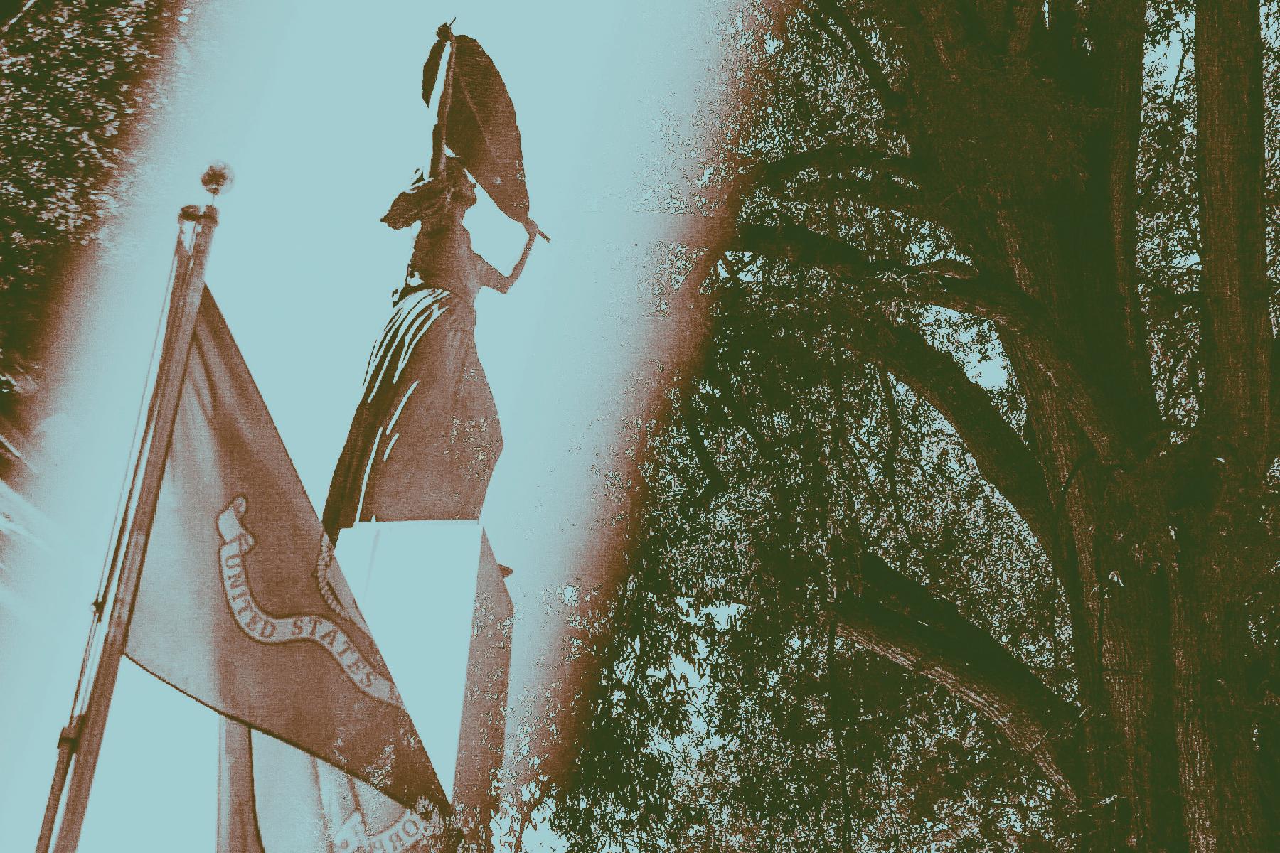
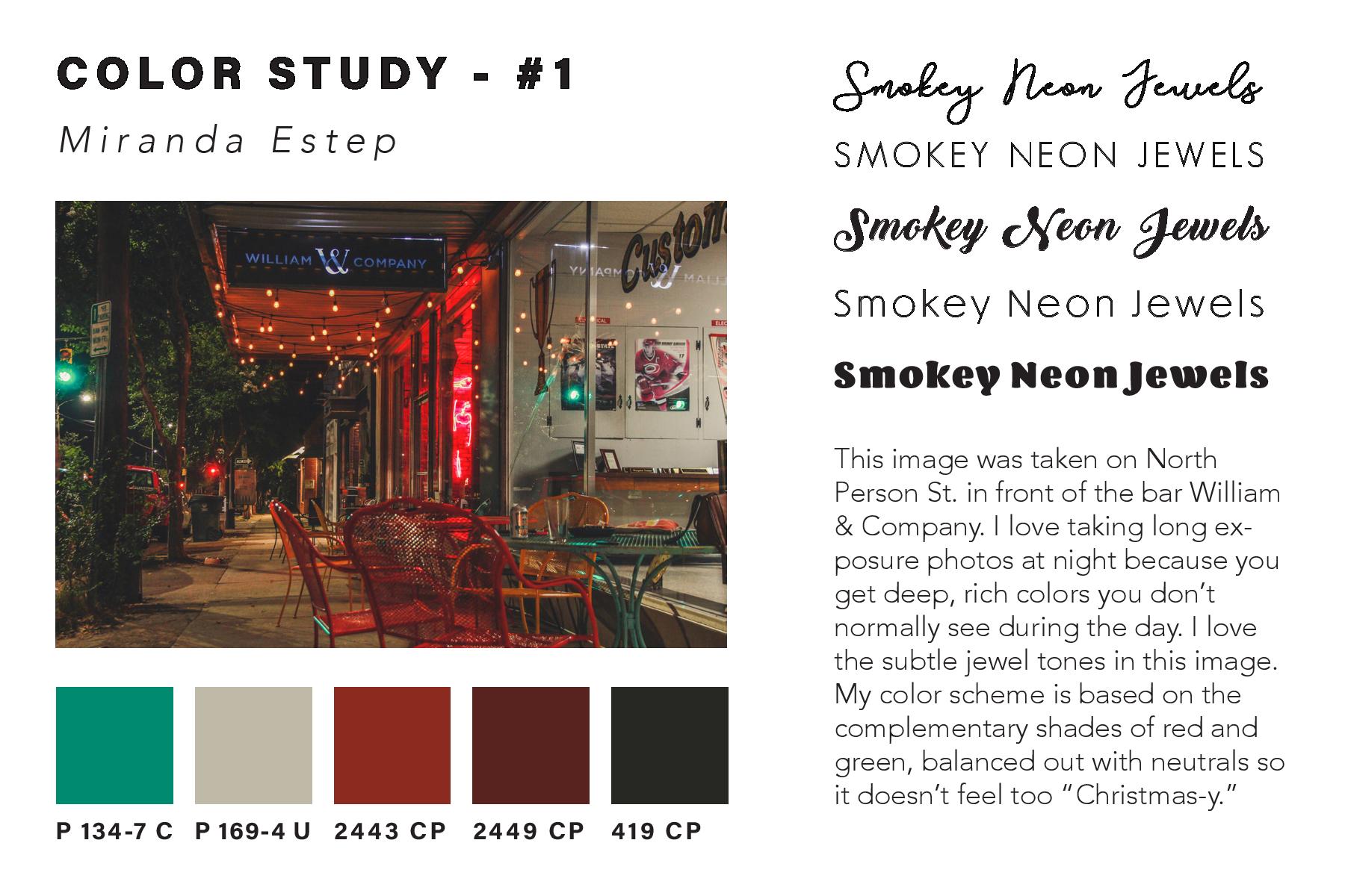
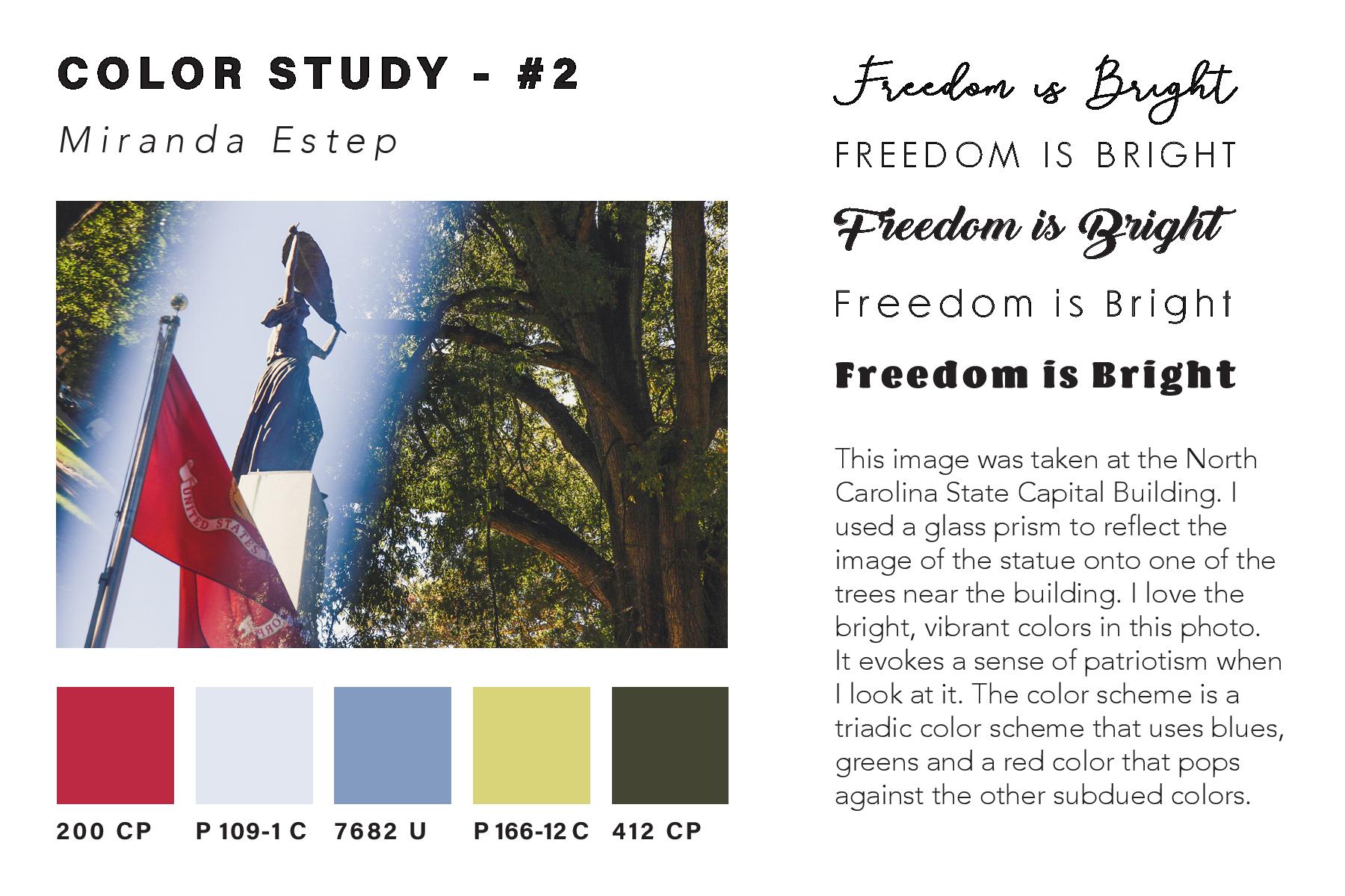
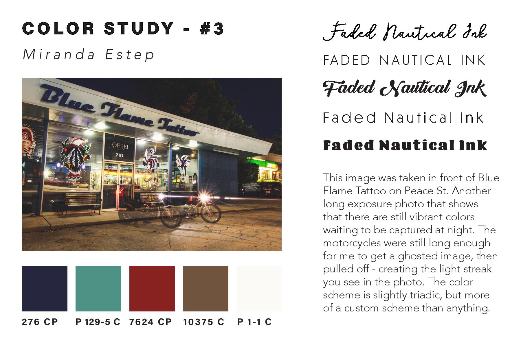
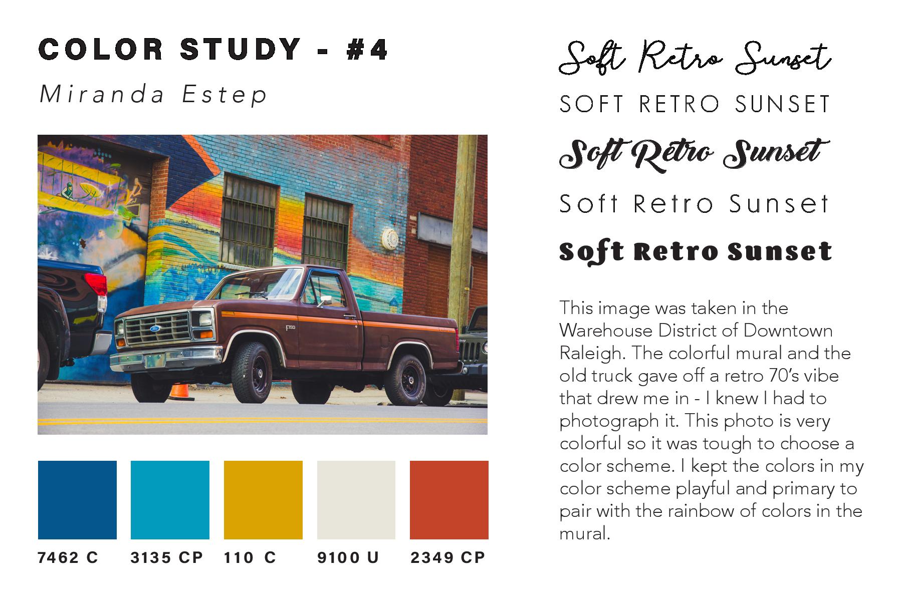
In my most recent project in Illustrative Imaging we were told to take four photos that focused on color and had a theme connecting them. I chose to take photos in the city of Raleigh, NC where I live. The theme for my photos was street photography / urban scenes. Below are the four original photos I took and chose to use for this assignment:
I thought these were the most colorful that I had taken and so would work well for this assignment. The next step was to take these photos and do color studies on them. I used the Adobe Color Wheel (you can find it here) to help me do this. After logging in with my Adobe ID on the site, I then clicked “import image” and uploaded each of the images to get a color scheme from them. The automatically chosen colors were not the best, so I had to adjust some of the points on the image where it was pulling color from until I got a result that I liked. I then clicked “save color theme” for each of the themes I created using the images, so that they would be saved as swatches in my Adobe Creative Cloud account – this way I could access them across all platforms.
In order to find the Pantone matches of the colors I chose, I visited Pantone’s website and searched each color from my color theme’s by their “HEX” number in the Pantone search feature. By doing this I was able to find Pantone colors that most closely matched the colors I had chosen for my color themes using the Adobe Color Wheel.
Once I had all of the Pantone names for my colors, I added them as swatches in my color study document underneath each of my photos. I then created a title for each of my images in five different fonts to see what font fit best with the image. I also wrote a description for each image, describing my concept and why I chose it. You can see the finished color study document below:
After creating the color study for each image and assembling it into one InDesign
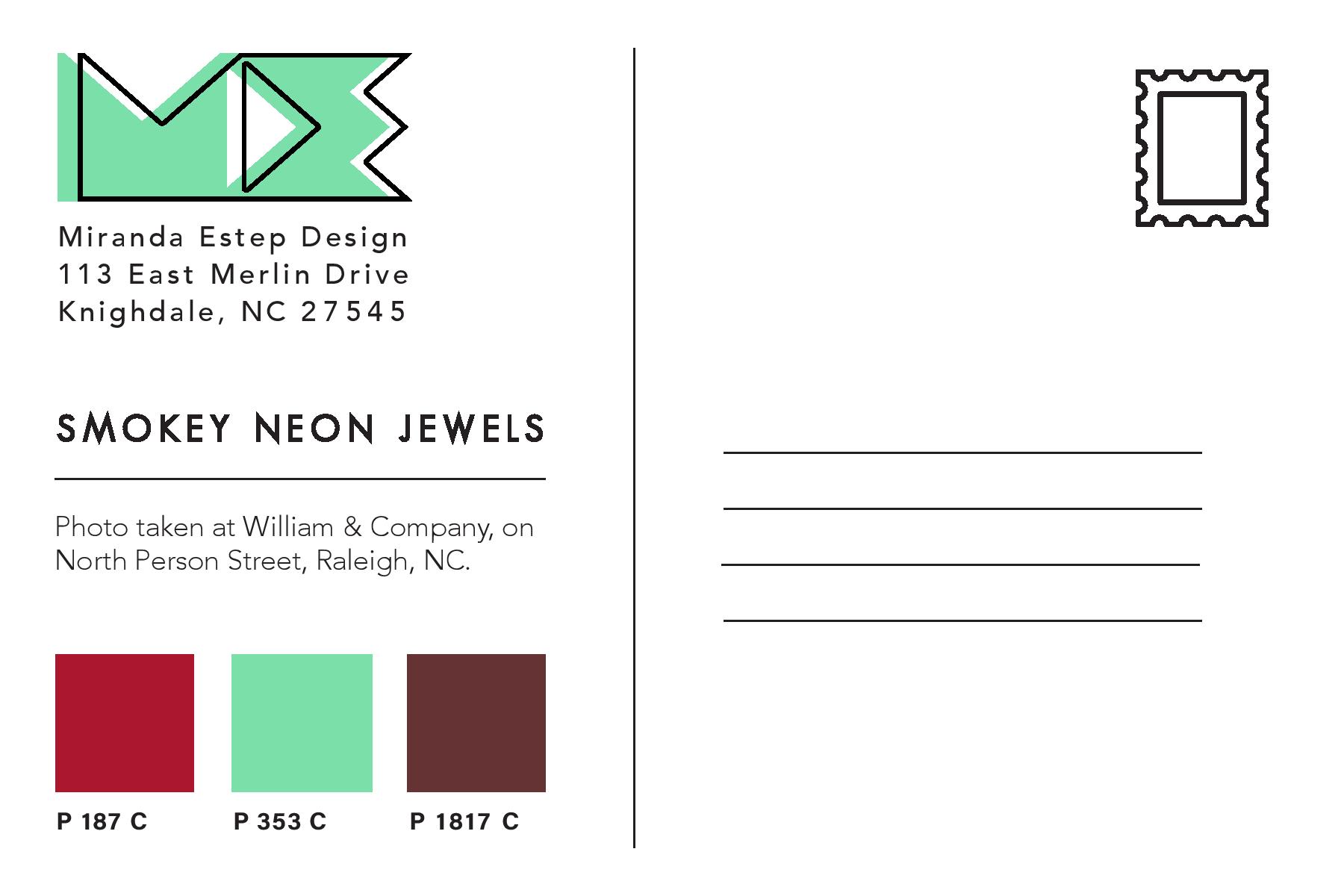
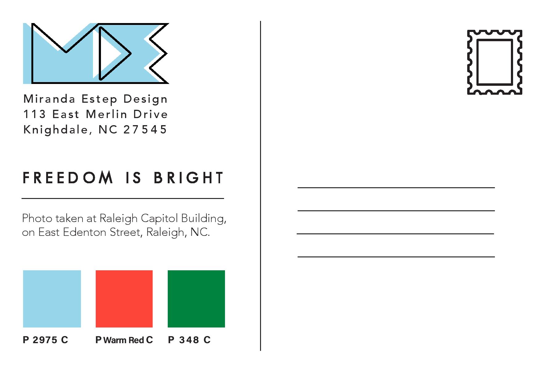
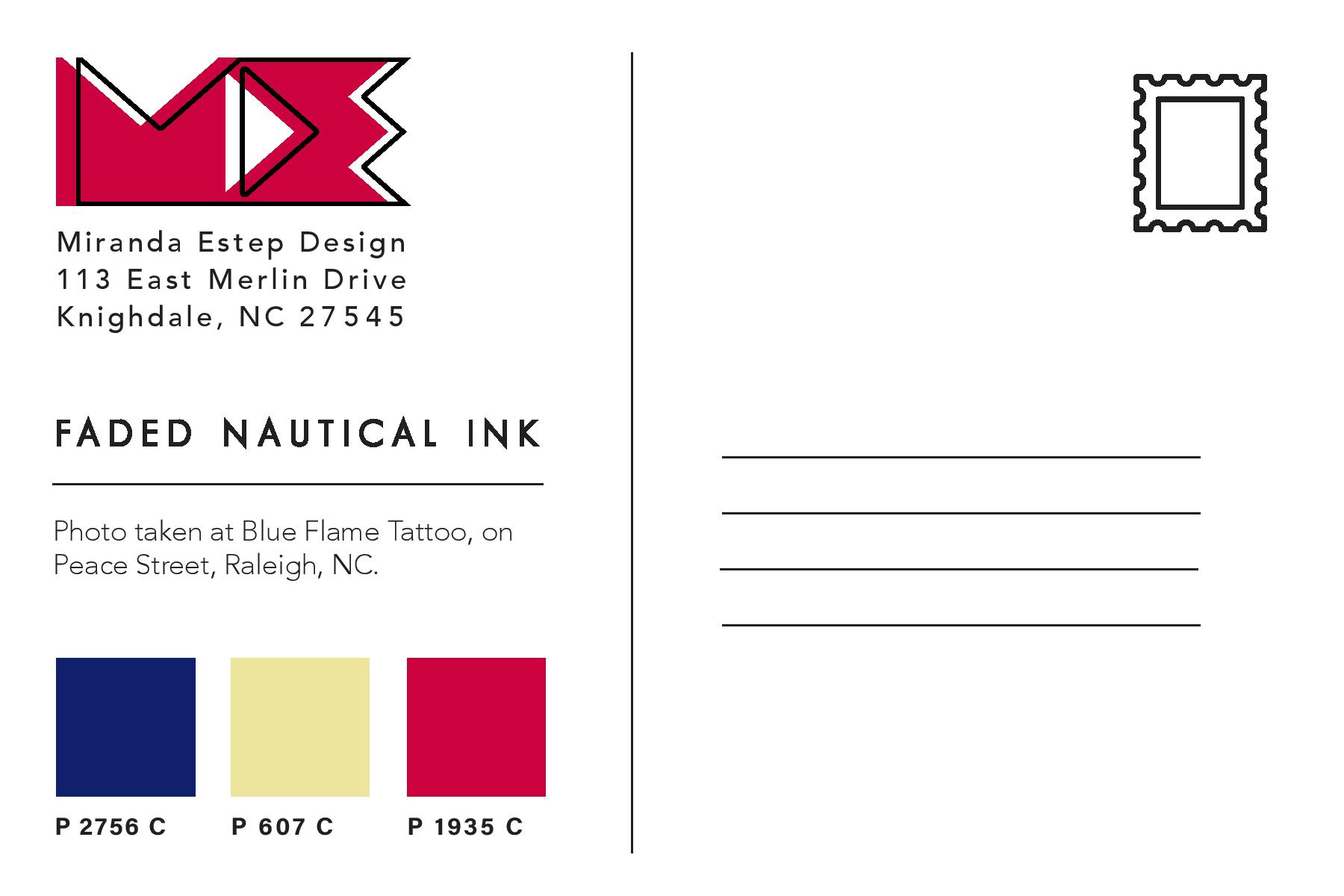
document, I then created Tritone images using my images and the Pantone swatches I chose during my color study. I used this Lynda.com video tutorial to create the tritone images. During the process I discovered that some of the original color swatches I chose were not showing up well together as a duotone or tritone image. Because of this, I chose different Pantone Coated color swatches for all of my images. I chose colors that were close to the original color swatches, but showed up clearly in the tritone image. My goal for the tritone image was to be able to distinguish each of the three color swatches individually. This way each color swatch added something to the image and was not lost to the viewer.
Below are all three of my final tritone images as postcard designs, featuring the three Pantone Coated swatches on the back and my personal logo, Miranda Estep Design, in the color of one of the swatches.
I really enjoyed this assignment because it challenged me as a photographer as well as a designer. I learned a lot about Pantone colors that I had not previously known and it gave me a new level of respect for Pantone. I would highly suggest any designer experiment with this assignment themselves.
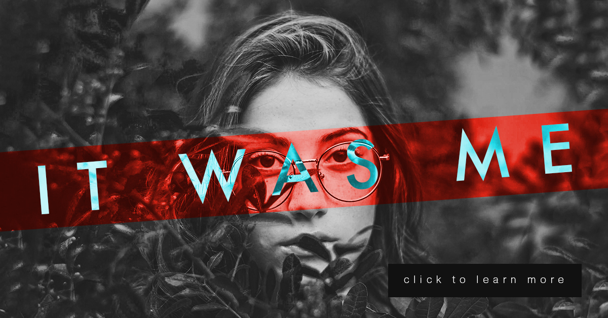
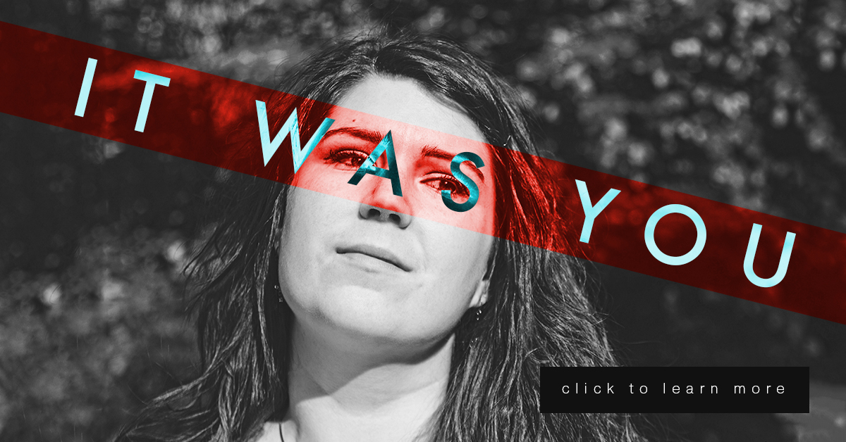
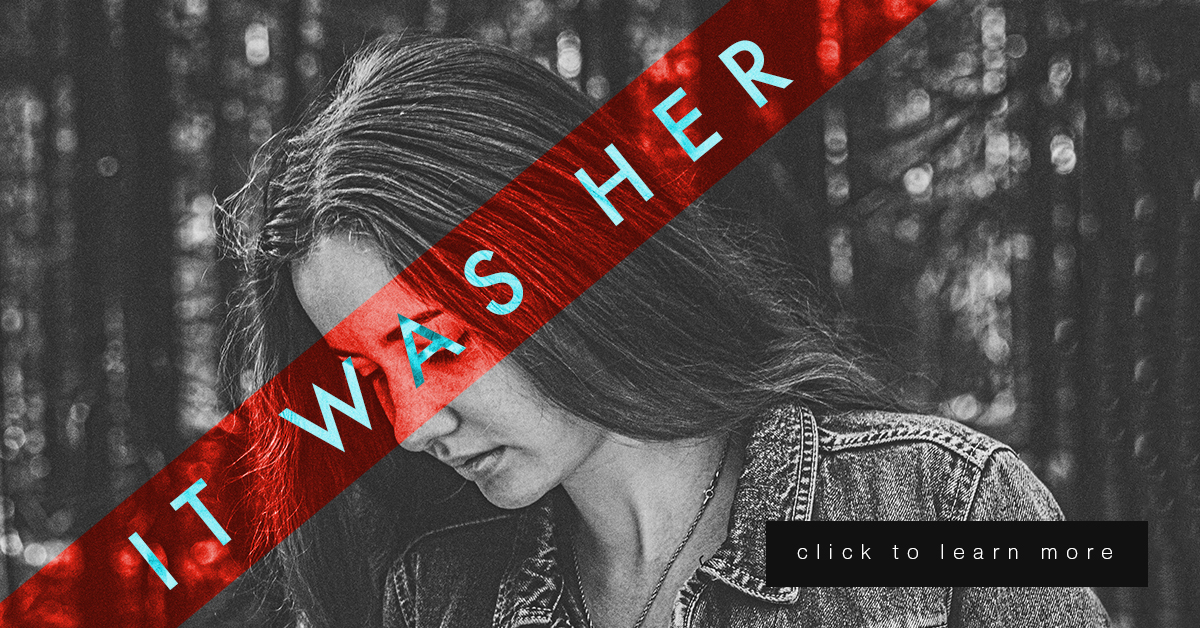
This week is a continuation of my last project in Illustrative Imaging, in which we took three portraits and created a social media campaign concept that would tie them together. This week we added a text “tagline” and a “call to action” button. My concept for these portraits was building on the #metoo campaign and the controversy it sparked. My portrait series and social media campaign is in response to the doubt and backlash women received after coming forward to report sexual assault. My campaign is an answer to those who ask “Who are all these women coming forward with allegations?” well, “It was her.”
For this series, there are three images of women so I decided to use a different phrase for each, which were the following: “It was her” “It was you” and “It was me.” They each draw attention to the fact that there are many individuals out there who have been sexually assaulted that are not making false allegations.
Each portrait will link the viewer to an interview with each sexual assault victim and will ask for a donation to the #metoo charity fund that goes towards the aid of sexual assault victims.
I did many sketches and variations of my design (included below) but I kept coming back to the idea of the women’s mouth or eyes being covered. The mouth or eyes being covered symbolizes the suppression of the woman’s voice and the blindness of society to the victims. So, I decided to use a technique from the “Bada** Photoshop Effects” book we are reading in class. In the book they use different layer styles to overlay text on images in interesting ways.
To create these images, I first made a red rectangular shape to go over the eyes and changed the layer style to “overlay.” I then put white text over the image and changed the text layer style to “difference.” I thought it was a very interesting effect. (Images below.)
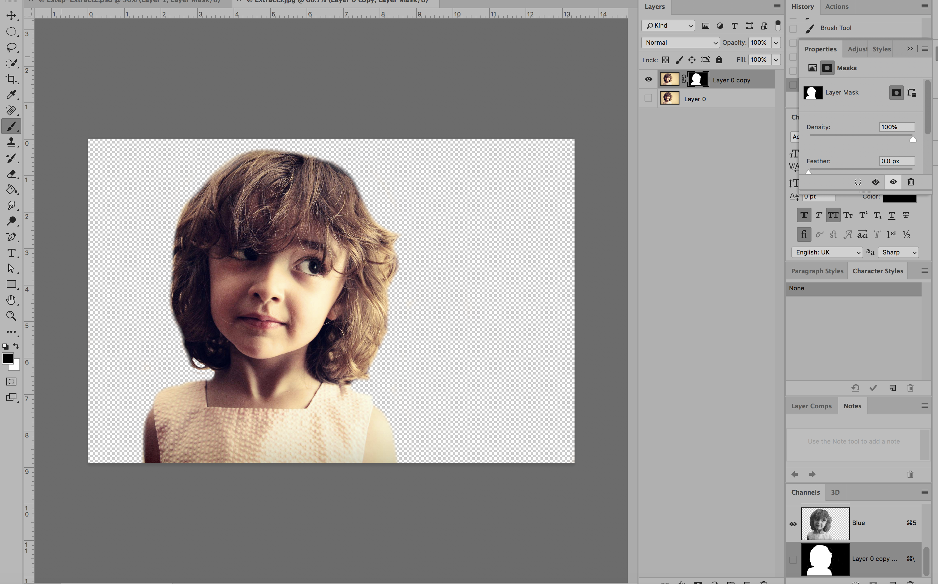
This week’s lesson in my Illustrative Imaging class was learning about masking and selections in Adobe Photoshop. I was already familiar with selections and selection tools, but not as familiar with masking. I knew layer masks were a useful, non-destructive method for photo editing, but I’d always used other work-arounds via layer copying instead of using masks because I was too lazy to practice using layer masks to get myself familiar with them. Well here was my chance: Time to learn about masking!
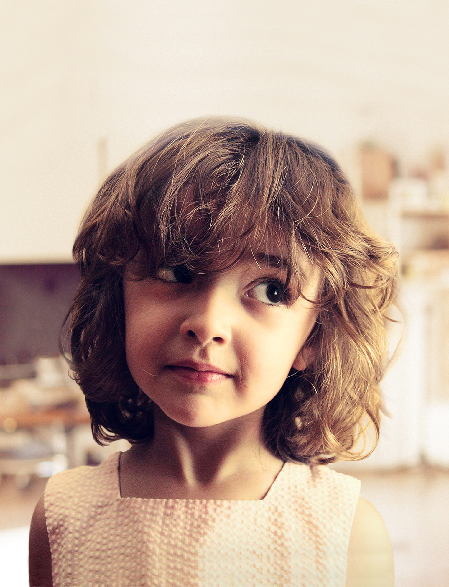
The first part of the assignment was to remove a subject in a photo from the photo’s background via masking (NOT destroying any pixels – simply making the photo to hide the background.) We had several options but I chose the image below:
Using the layer mask tool, I painted everything I wanted to remain visible WHITE and everything I wanted to disappear BLACK. Below was the result:
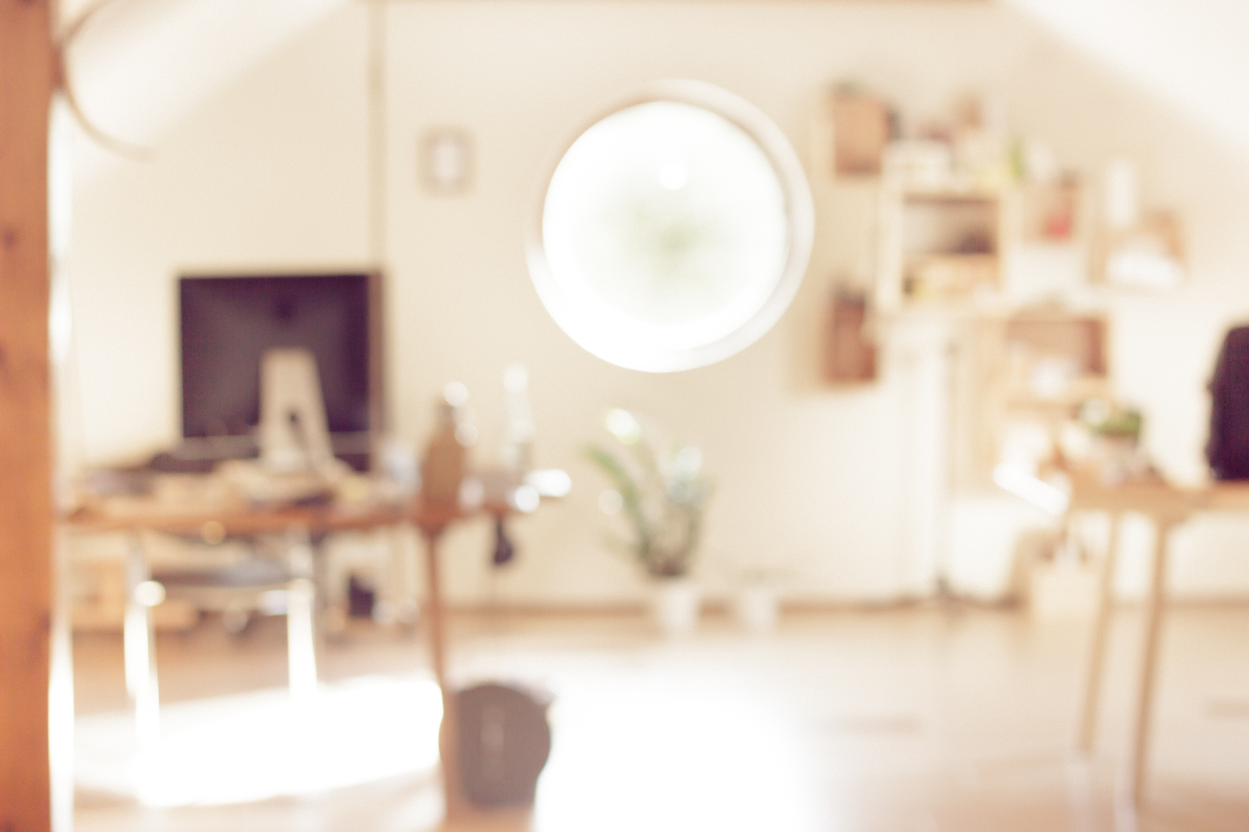
The next part of the assignment was to come up with a “pattern” or background image to go behind the subject. In order to avoid any copyright infringement, I used the Creative Commons database to search for an image that would be free for use. I found a blurred image of a room with similar colors that I though would work well with the image. Here it is below (Image source link here: https://pixabay.com/en/blur-office-background-blur-office-2926794/ ) :
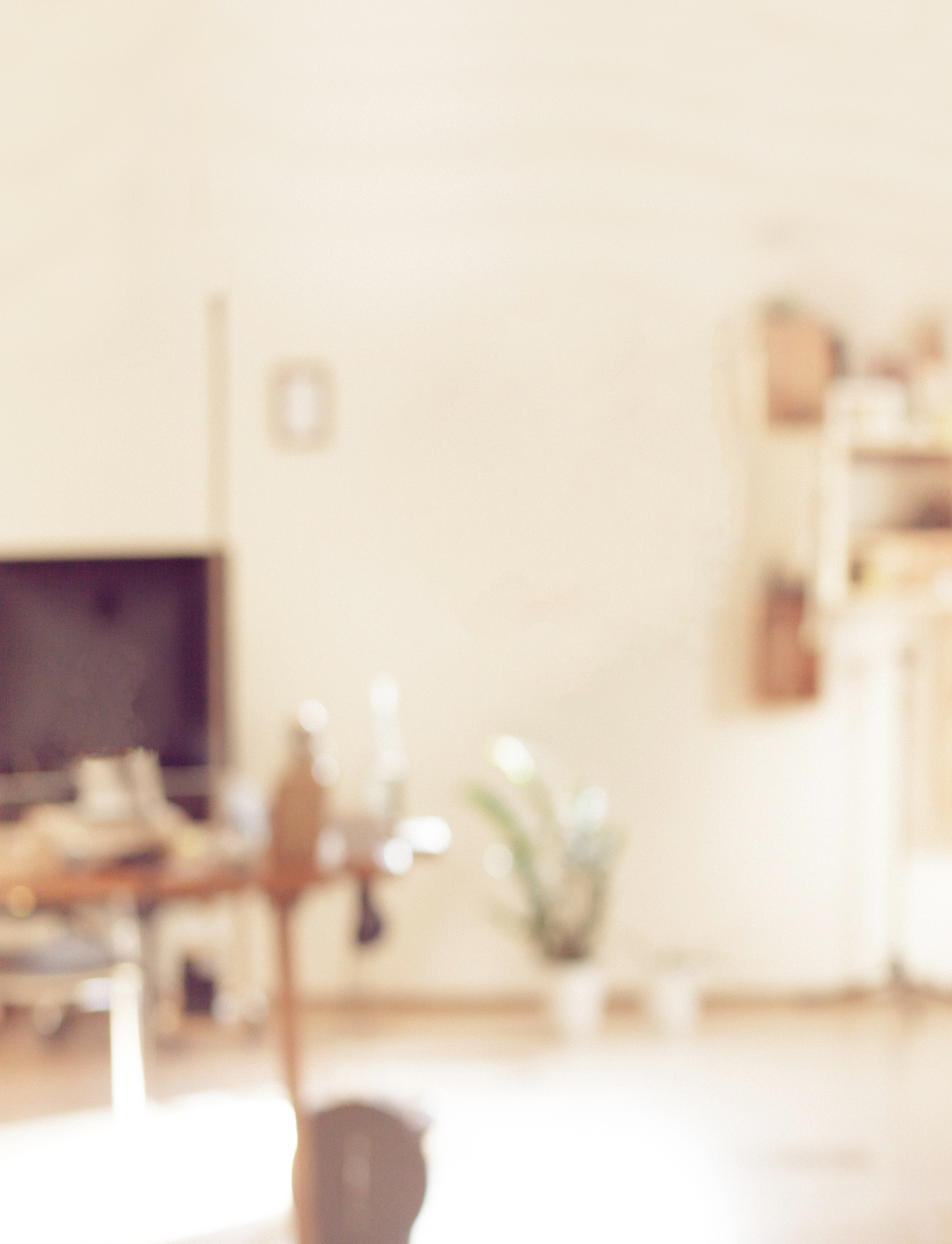
I then edited the background slightly and cropped it in order to add the photo of the girl on top. Here was the edited background:
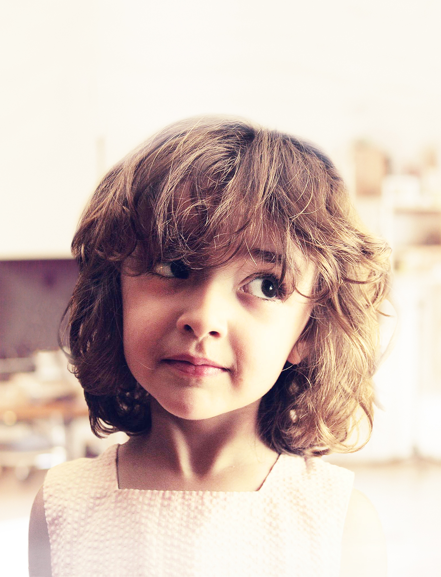
I removed the window from the background image so the bright white color would not be seen behind the girl’s head. Here’s what it looked like once I added the girl onto the background:
I then added two adjustment layers to edit the contrast, brightness, hue and saturation of the image. My goal was to lighten the image so that the text I would add on top would be highly visible. I also added an additional layer that I painted with the paintbrush tool (using the color white at 50% opacity) to lighten just the bottom of the image where I would add text as well. Here is the photo after two adjustment layers have been added and the paint tool was used:
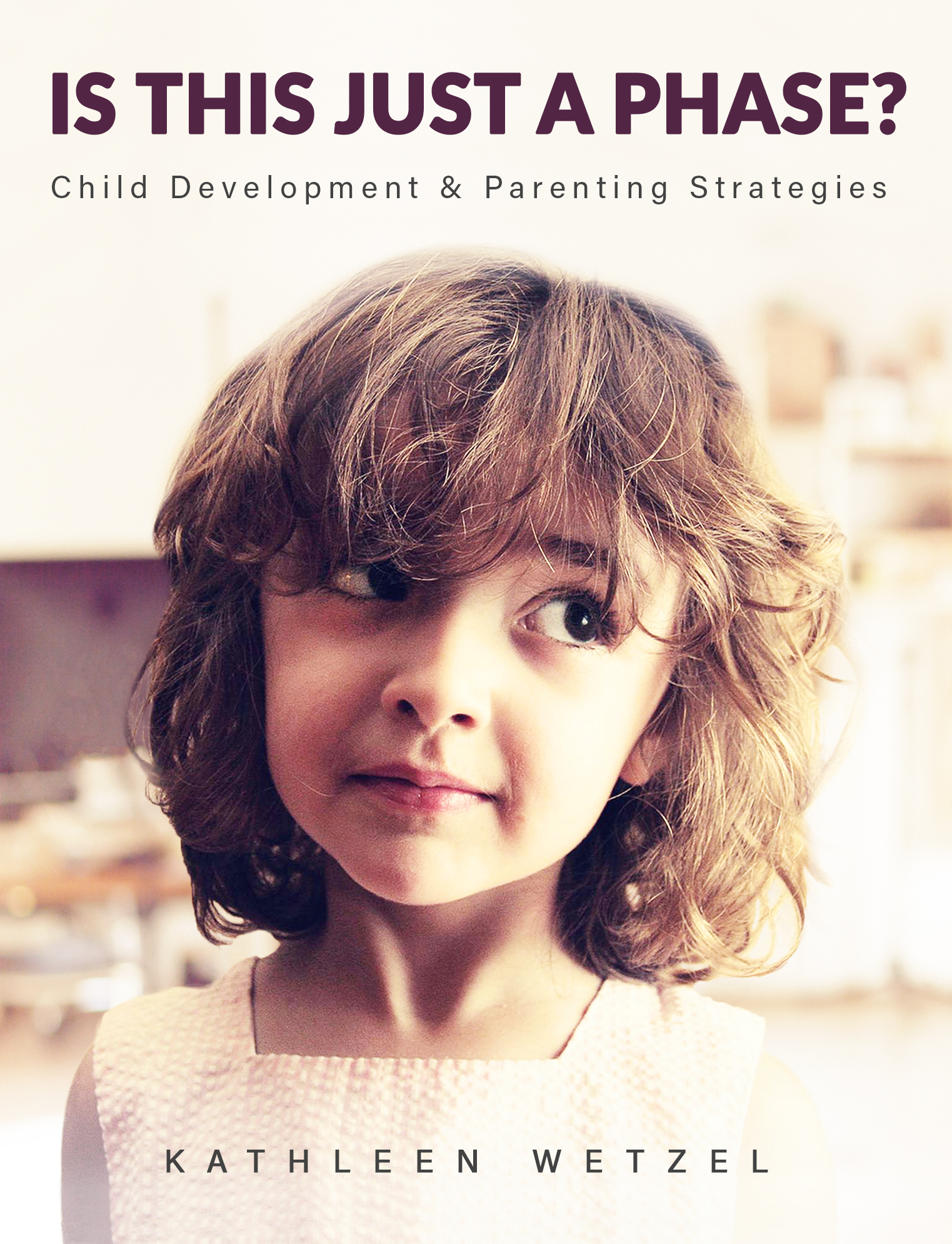
The final part of the assignment was to add text. I decided this photo looked like a child who had just gotten into some trouble and was being scolded for misbehaving. So, I decide to make this image a book cover for a parenting and child development book. Below is the book cover after I’ve added the Title/Heading, Tagline/Subheading and the author’s name:
I chose to simply use the author’s name and not include the word “By” because during my research on other books of the same genre, most did not include “By” in front of the author’s name. Overall I feel I was most successful with blending the subject into the background image so that it does not look like it’s floating. If I could do it over, I would like to improve on my use of typography and how it integrated with the rest of the design. This was an interesting assignment and helped me finally understand and utilize masking. You should try it out yourself!
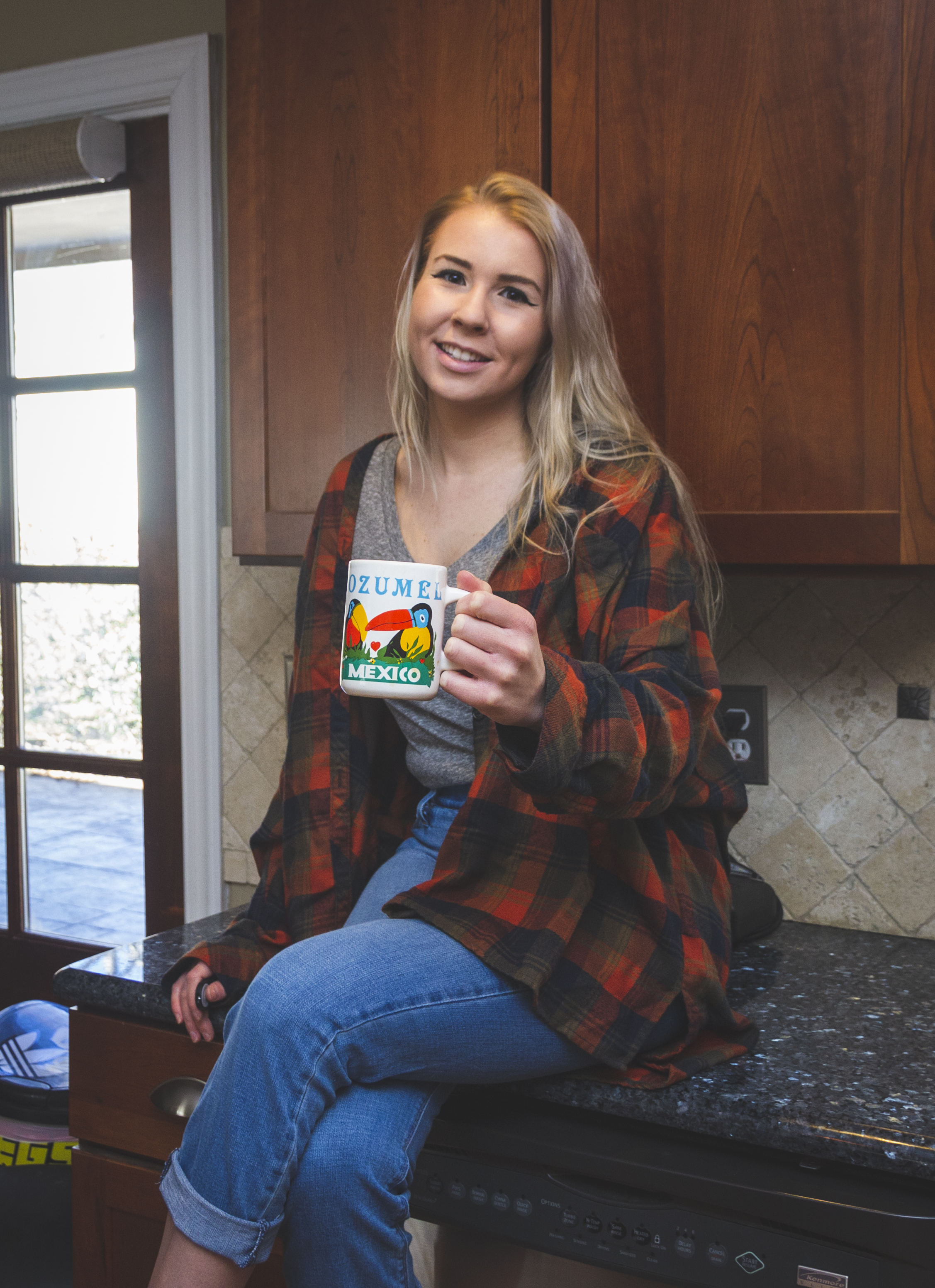
Hello everyone! Today’s post covers my third week in Illustrative Imaging, an online course I’m taking at Wake Tech. The prompt was to take a portrait (self or otherwise) in a kitchen while holding a colorful mug. We were also instructed to leave overhead lights on in the kitchen, in order to give the photos a yellowish cast. The objective was to perform photo corrections on the photo using Photoshop’s RAW interface.
Below is my original image (shot in RAW, per the assignment):
As you can see, there is a yellowish cast from the overhead lights, which needs to be fixed by changing the white balance. I also need to crop this image to frame the subject (me) better. I also need to do mild blemish correction on my skin and face. Because my lens is slightly wide angle, I will also need to use the built in lens correction feature of the RAW interface to correct the ‘bulging’ caused by lens distortion. The contrast of the photo could be changed as well to suite my preference. Finally, I will also use a few presets included in the RAW interface to make the photo more ‘flat’ and ‘matte’ which is a look I prefer in my photography.
Below is the final result of my editing using the RAW interface:
As you can see, this results in a much more pleasant photo. Below are the before and after side-by-side so you have a better understanding of the changes:
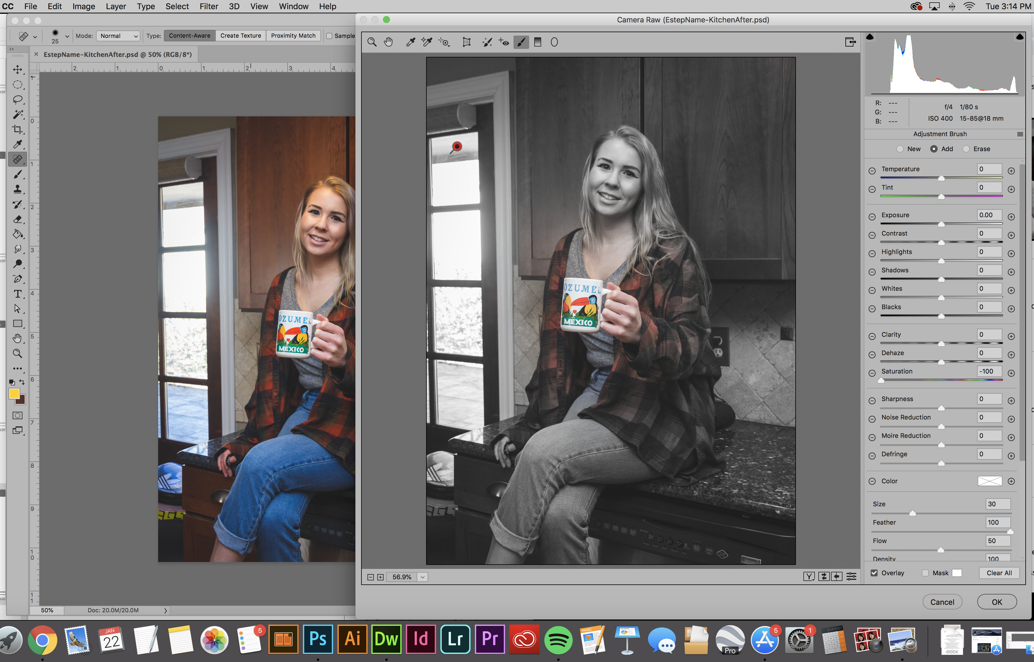
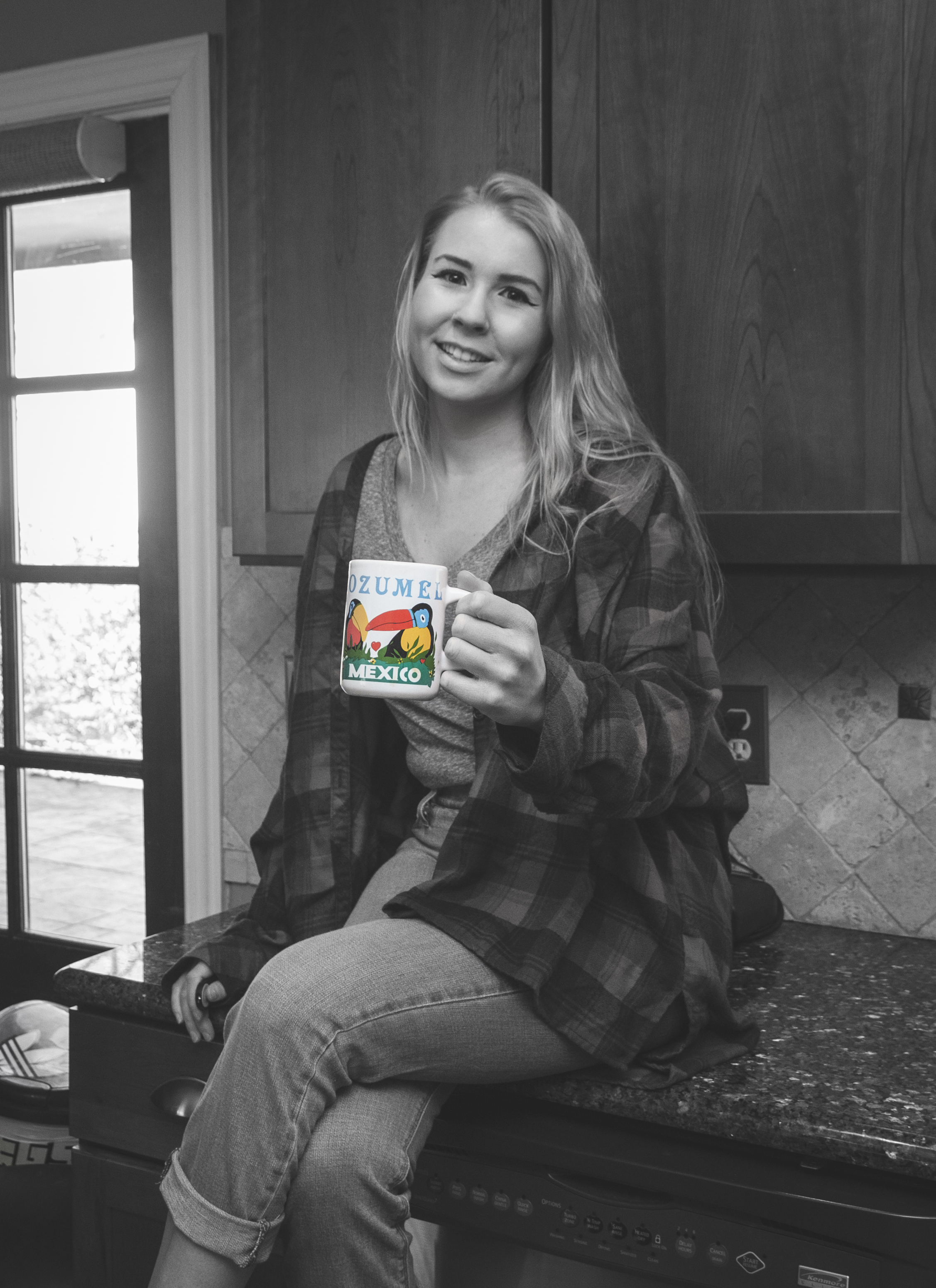
The second part of the assignment was to use the correction brush to desaturate everything in the photo except the colorful mug. Below is a screenshot of me using the correction brush to accomplish this:
The final result:
Again, I’ll include the before and after below so you can really see the difference:
Overall, this exercise was a great introduction to the Photoshop RAW interface, which is something I’d previously ignored before, opting to edit all my photos in Adobe Lightroom instead. I look forward to learning more about what editing in Adobe Photoshop’s RAW interface has to offer and hope my fellow photographers out there give it a shot as well. Cheers,
– Miranda
Fall Semester is in full swing and with it comes work, work and more work. Luckily, I love what I’m learning and a lot of times it doesn’t feel like work, especially when it comes to my Drawing Fundamentals class.
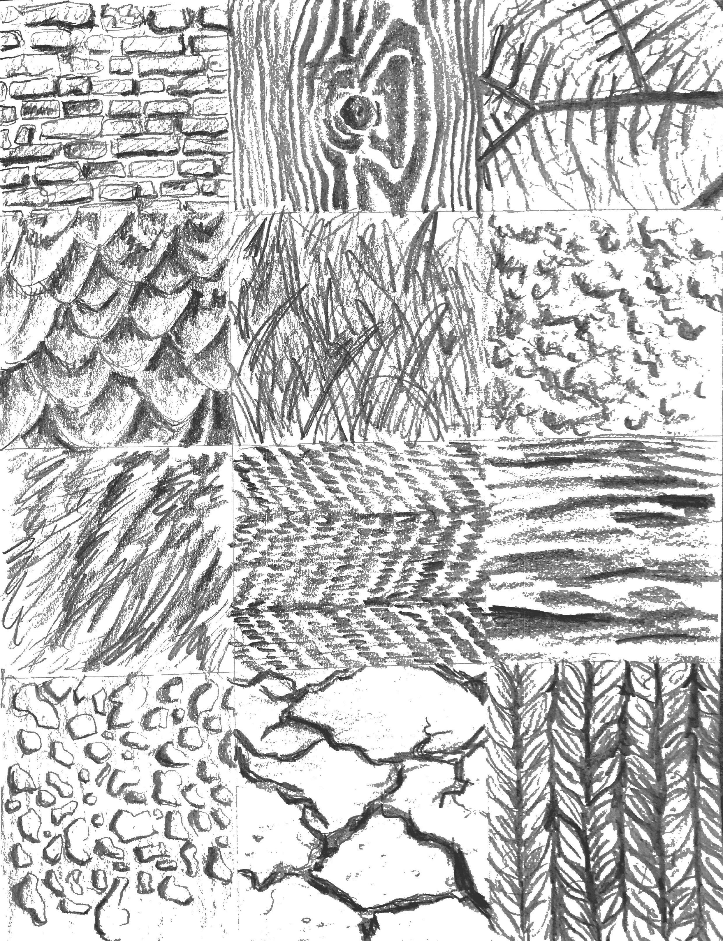
These past few weeks we’ve been focusing on texture and proportion. Week 3 was an exploration of texture through imitation. Below are the 12 textures I imitated in my sketchbook.
On the surface this assignment seemed easy but was actually quite difficult. One of my biggest challenges as an artist and a designer is having patience, especially with repetitive tasks. This involved a lot of repetition, because the basis of texture is pattern and pattern is based on recognizable repetition. This exercise forced me to slow down my method and to really look at my subject when creating texture, rather than inventing what I think the texture looks like in my mind.
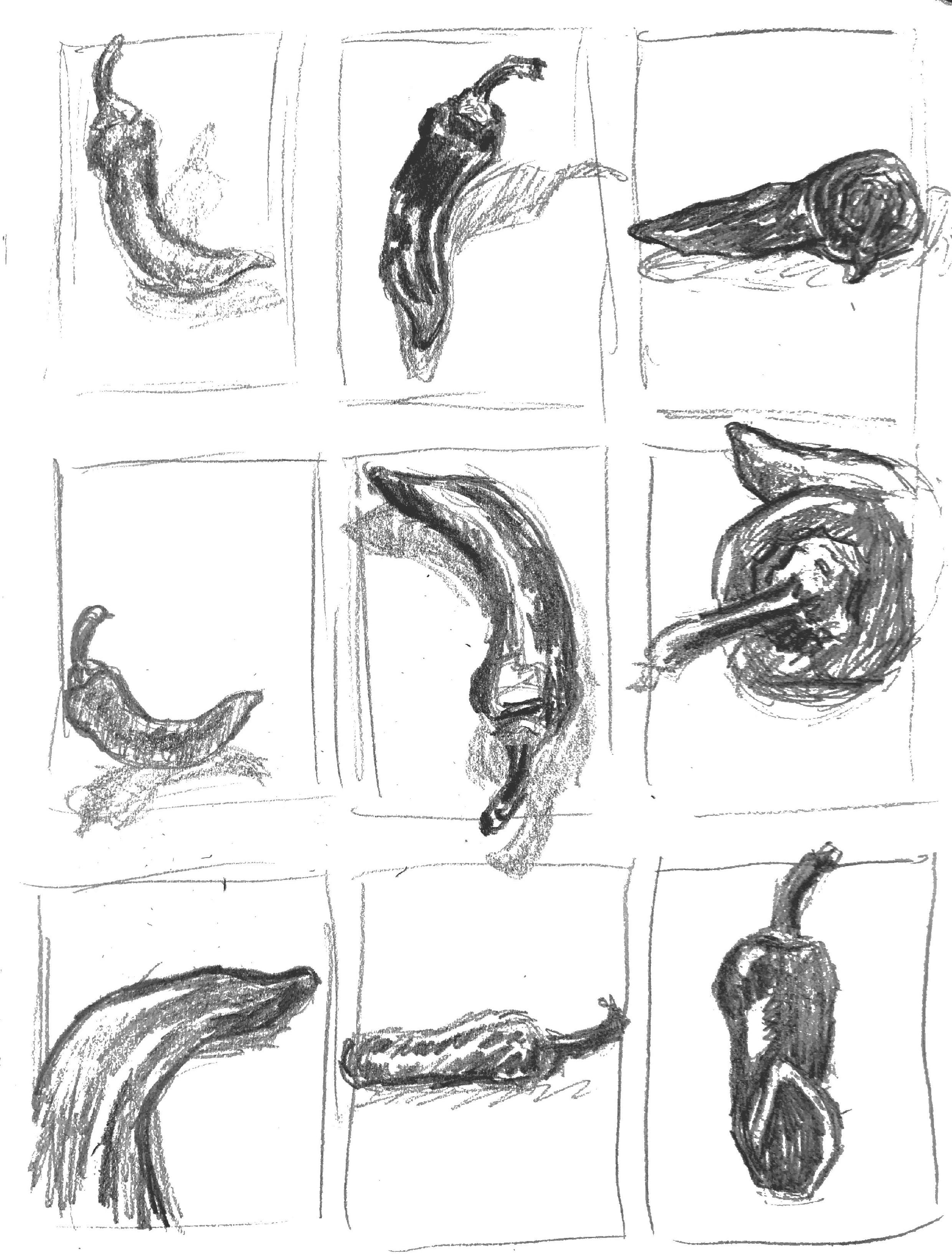
Week 4 we moved on to proportion. Our lecture focused on logos and how they are based on recognizable objects that have been simplified to their most simple forms. They are recognizable as the original object in huge part due to their proportion. Below are my initial 18 thumbnail sketches of a pepper for the assignment.
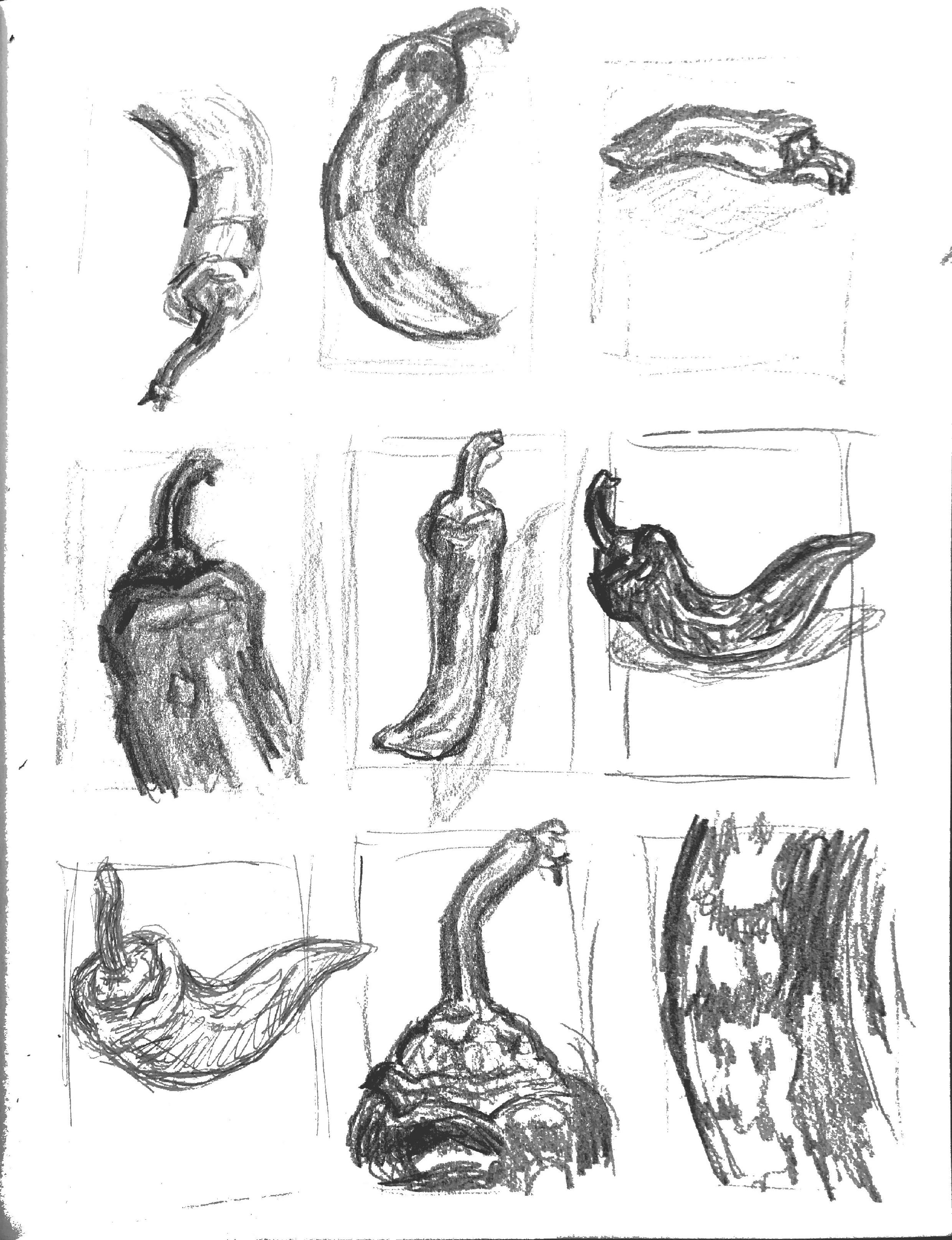
The next step was to take 3 of your most interesting thumbnails and develop them further. Below are my 3.
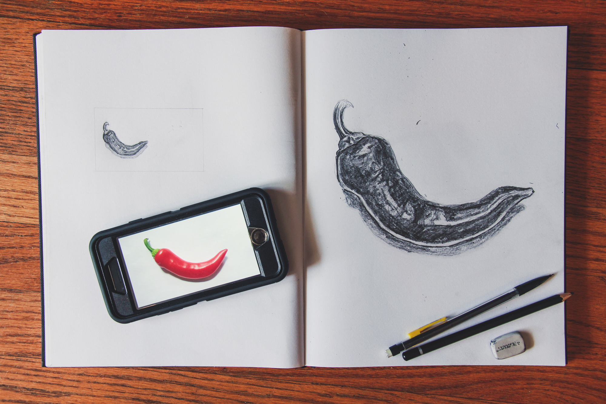
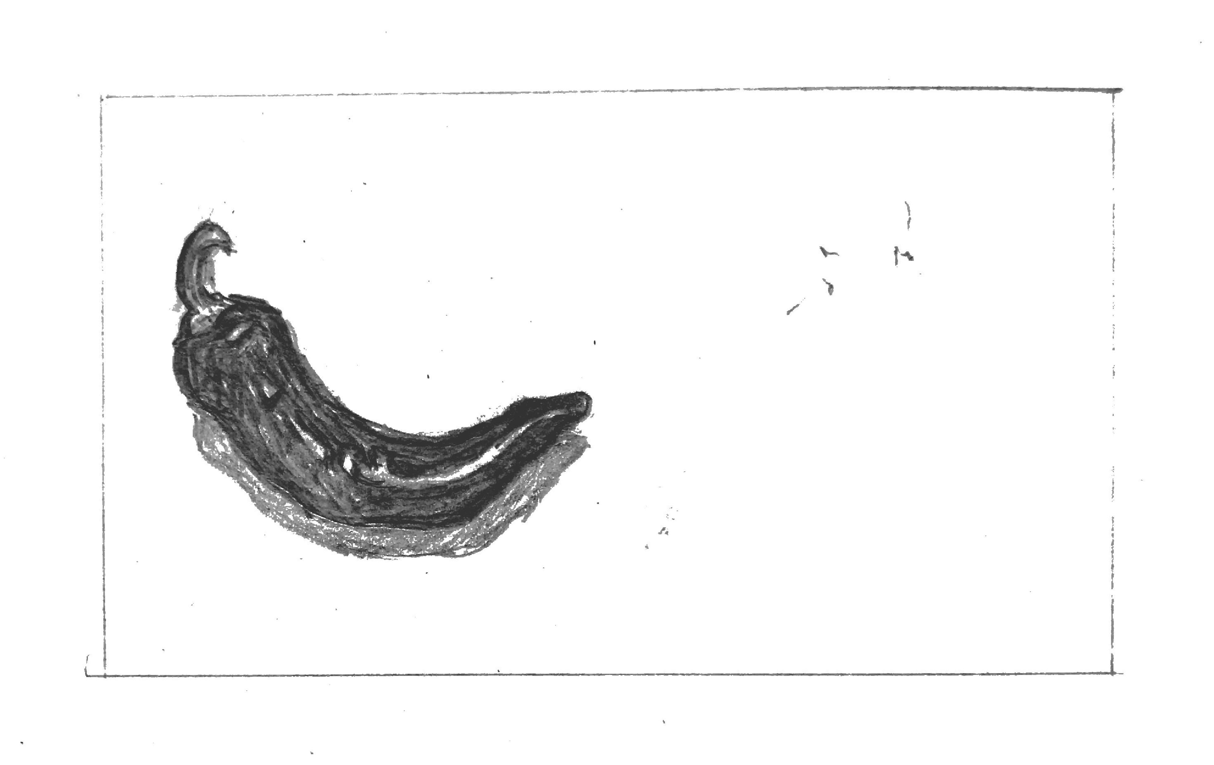
Finally, you were to take 1 sketch of the 3 refined thumbs and draw it at the scale of a standard business card, as well as that of a standard letterhead. Below are my final drawings as well as the original object.
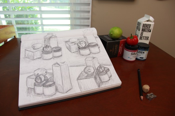
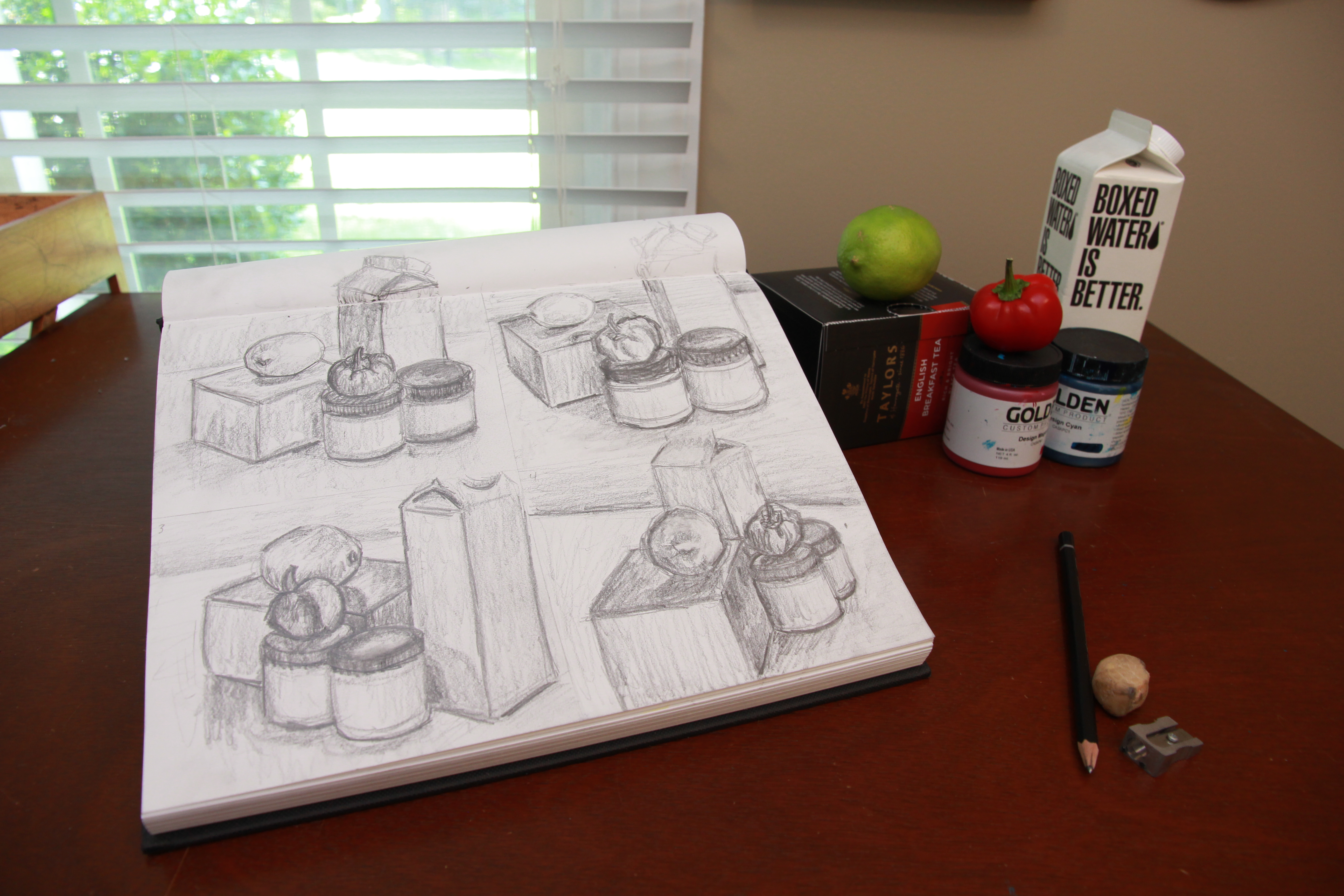
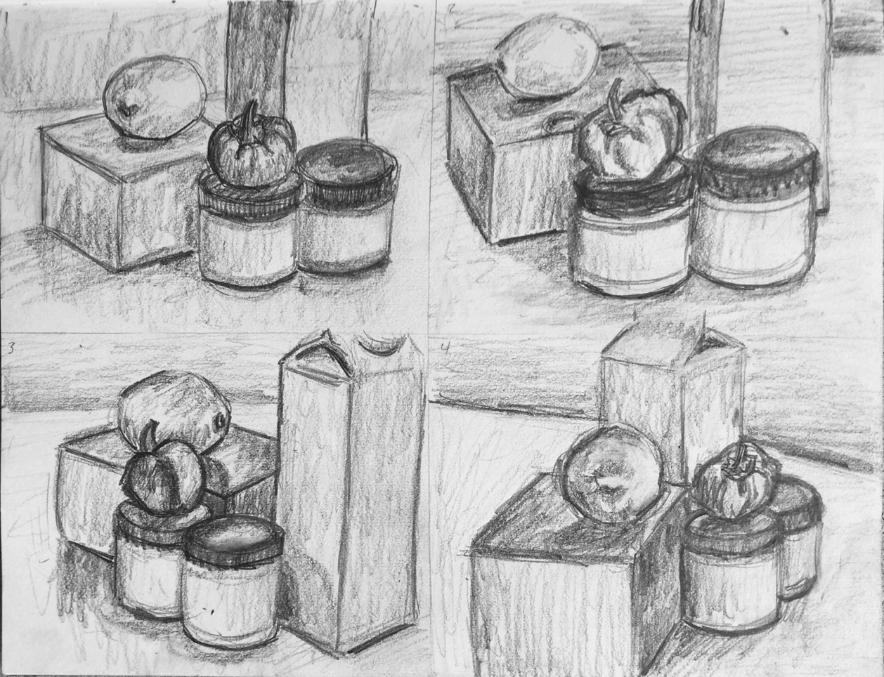
Today I finished up week two of my Drawing Fundamentals class. Although I’ve been drawing since childhood, I still feel that I have a lot to learn. This weeks assignment was to watch a few videos on cross hatching, stippling and shading as well as draw a still life from four angles. Below is my completed still life sketches. (Total duration to complete all four drawings ~45 mins.)
This exercise helped me loosen up a bit and get more comfortable with sketching again. I tried drawing more with my arm instead of just my wrist, which allowed me to draw more loosely.
The biggest challenge for me in this assignment was proportion. The carton object in my still life provided the biggest challenge, it was too tall for the small quadrants on my sketchbook page so it kept getting cropped out of each composition. The lighting I had was also challenging, because there were two competing light sources – the ambient light from the window and the light from the lamp to my back right.
This exercise would be great for any artist who wants to loosen up their sketching style and practice shading forms of different shapes and sizes.
You may not know Chana Lynn, but I’m sure you know her blog – RaleighWhatsUp. Chana’s blog is a trusted source of all things Raleigh – what to do, where to go and most importantly – who has the best eats!
Chana has lived in Raleigh for the past 16 years, so you know she’s an expert on the subject. I first stumbled onto her blog a few months ago when a friend of mine showed me the RaleighWhatsUp Instagram. Since then I always check Chana’s blog or Instagram whenever I’m searching for something new to do in my home city.
Because of her established authority of all things Raleigh on social media, I decided to make Chana the focus of an an assignment for my Social Media class. I sent her a few questions and she kindly obliged me – her answers are below.
What Social Media channels do you use related to your interest?
I use the following on a regular basis: Instagram (My favorite!), Twitter, Facebook, Pinterest, Blogger, Offline (local App), Cureat (another local App), Swarm and Untappd.
How much time do you spend each week on this Social Media Marketing?
That’s hard to say, I try to post or share on social 1-3x a day to IG/Twitter and post a blog update 1-3x a month. I guess per week its probably 5 hours or so a week. More if I’m doing more specific blog posts as an influencer or sharing an event that I’ve attended which could add 5-10 hours.
How do you engage visitors to participate and share their content?
I try to engage visitors by sharing/posting things that are current/relevant, something unique or new that they may not have known about around Raleigh or places we visit. I try to make the posts visually interesting to get them to stop and read and engage. Sometimes I might ask a question, often I will respond to questions and comments posted on my social. I often find that visitors/followers will tag their friends and family to make them aware of restaurants, shops, new openings in Raleigh and the Triangle, etc.
How does this social media engagement benefit you?
I love hearing from followers that they go to RaleighWhatsUp to find out where to eat, dine, shop, etc. I love getting local Raleigh people to spend time in their local coffee shops, restaurants, breweries, boutiques etc and support their local business owners. I think being authentic and real helps to grow a local organic following and this in turn opens up work opportunities for me to do social media or website design for businesses, as well as opportunities to partner with local businesses or be a local influencer for different brands/hotels, etc.
How does this social media engagement benefit your audience?
I hope that it benefits my audience by highlighting all the great things about their city and helps them find out more about things they are interested in whether its art, food, drink, architecture, shopping, travel and more. I think people enjoy being in the know, especially about where they live. I hope it gets people out exploring and engaging with friends in cool places in and around Raleigh. Life is about experiences and the more people are out supporting small businesses and having great experiences the more exciting and better off Raleigh will be!
As you can see, Chana is well versed in social media and uses it to tell the story of the beautiful city of Raleigh, NC and it’s people. If you haven’t checked out RaleighWhatsUp, you’re missing out – Click here to view Chana’s blog.
Since discovering RaleighWhatsUp I’ve fallen even further in love with Raleigh and the surrounding area – Thanks Chana!
Comment below if you love the city of oaks & answer this: What do you think Raleigh needs more of?
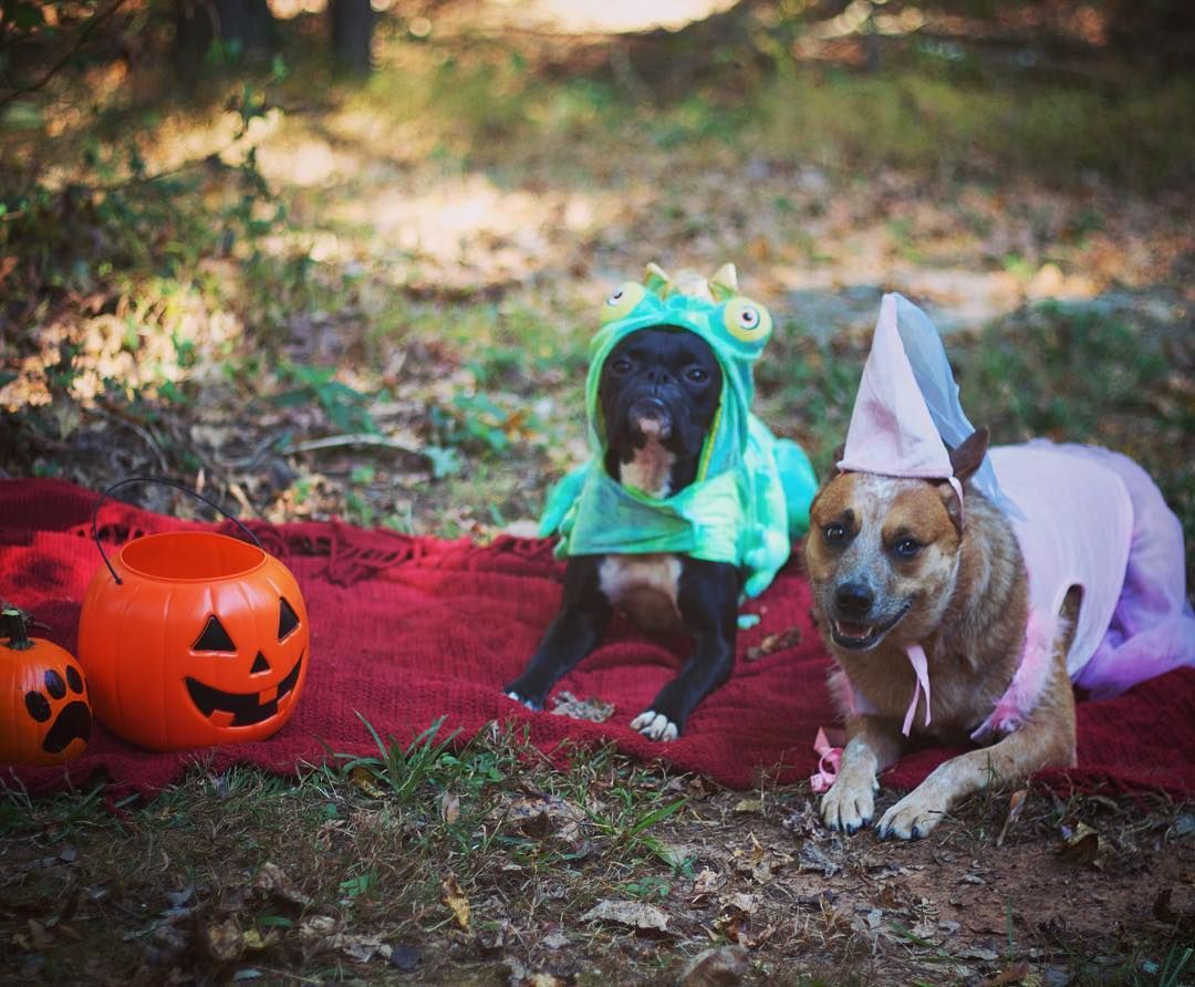
As a hobby photographer, I love learning new tips and tricks about how to improve my photography skills. I’ve seen many articles out there that cover similar topics,like this one by Zuke’s, which I really enjoyed. Zuke’s is one of my favorite dog treat & supplement companies, so I was very interested in what they had to say about pet photography.
Zuke’s talks about Lori Fusaro and how she began photographing dogs. She volunteers to photograph homeless dogs who are up for adoption to increase their chances of finding a home – an AMAZING undertaking on her part.
A lot of people don’t know that most animal rescue organizations do not have the time or funds to hire professional photographers to photograph the animals in their care. Many dogs listed for adoption online have dark, blurry, pixelated photos – or no photos at all.
Lori’s story is inspirational and should encourage all of you to offer your help to your local animal rescue. Lori’s photography tips are all useful as well (see them here) but I have a few more to add myself.
1. Photograph your dogs outdoors. Outdoor shots can provide dynamic results.
2. Photograph during the “golden hour” – the hour or two before sunset that provides a diffused, “golden” light which is ideal for photos.
3. Make sure your shutter speed isn’t too slow. Dogs move fast and you don’t want blurry pictures.
4. Take your dogs leash off – with editing! Set your fears at ease by simply editing your dog’s leash out of pictures with the “heal” or “clone” tool during the editing process. (You can also edit off their collar.)
5. Focus on the eyes. Make sure your dog’s eyes are in focus in close up shots and brighten them during the editing process afterwards.
6. Use props. Most good photographers already know this – but don’t be afraid to experiment. Have your pup hold an object in it’s mouth, like a branch, flower or other object related to the scene they’re in.
7. Squeak at your dog! If you feel like you’re losing your dogs attention (treats and toys aren’t cutting it ) make the weirdest high-pitched noises you can think of. It works – I promise.
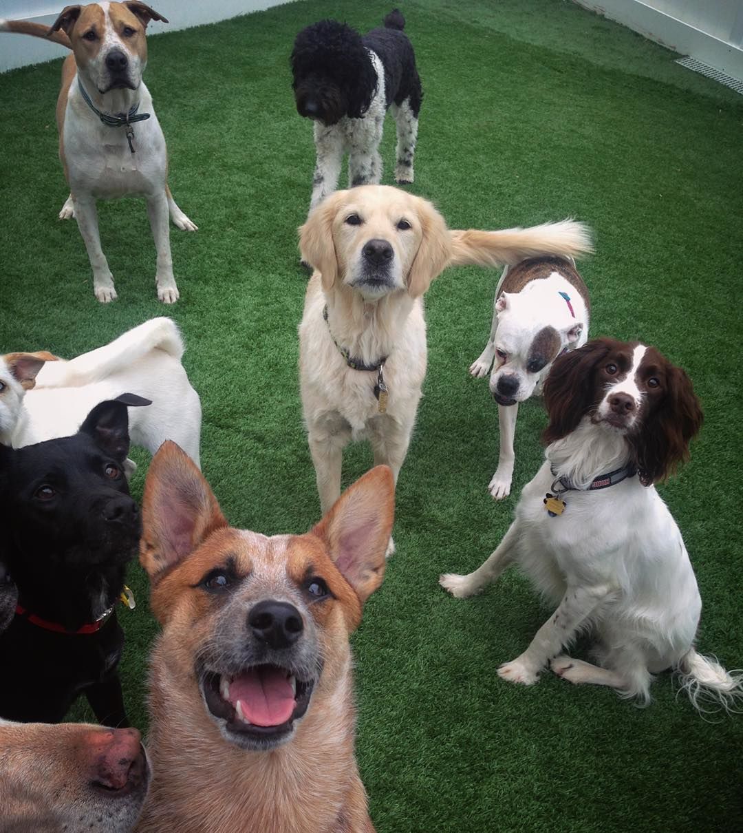
8. Have a playdate. Photos with multiple dogs provides great variety if your solo shots are getting stale. Try visiting a dog park or hang out with a friend that has a dog.
There are MANY more tips out there, but the most important thing to remember is to do what works best for you, your camera and your dog – so get out there and start shooting!
If you have any questions about photography, dogs or anything else, be sure to leave a comment below and I’ll get back to you. If this post helped spark some new ideas with my fellow dog photographers out there – be sure to share it.
Hello everyone! Welcome to my blog. This is where I will be sharing content that interests me as an artist, designer and dog trainer. If you don’t know me, allow me to introduce myself.
My name is Miranda Estep and I’m an artist and a designer. I started out with a pen and pencil, like most do, but soon moved behind a lens. Because of my background in traditional media, I tend to focus on similar elements when taking photographs or filming – light versus shadow and the way they define form. My personal design aesthetic is influenced heavily by nature while remaining simple and organized. I strive to design solutions that best meet the needs of my client while maintaining my core values of innovation, integrity and environmental sustainability. My long term aspirations are to work full-time as a designer and to give back through charitable work for animal welfare organizations.
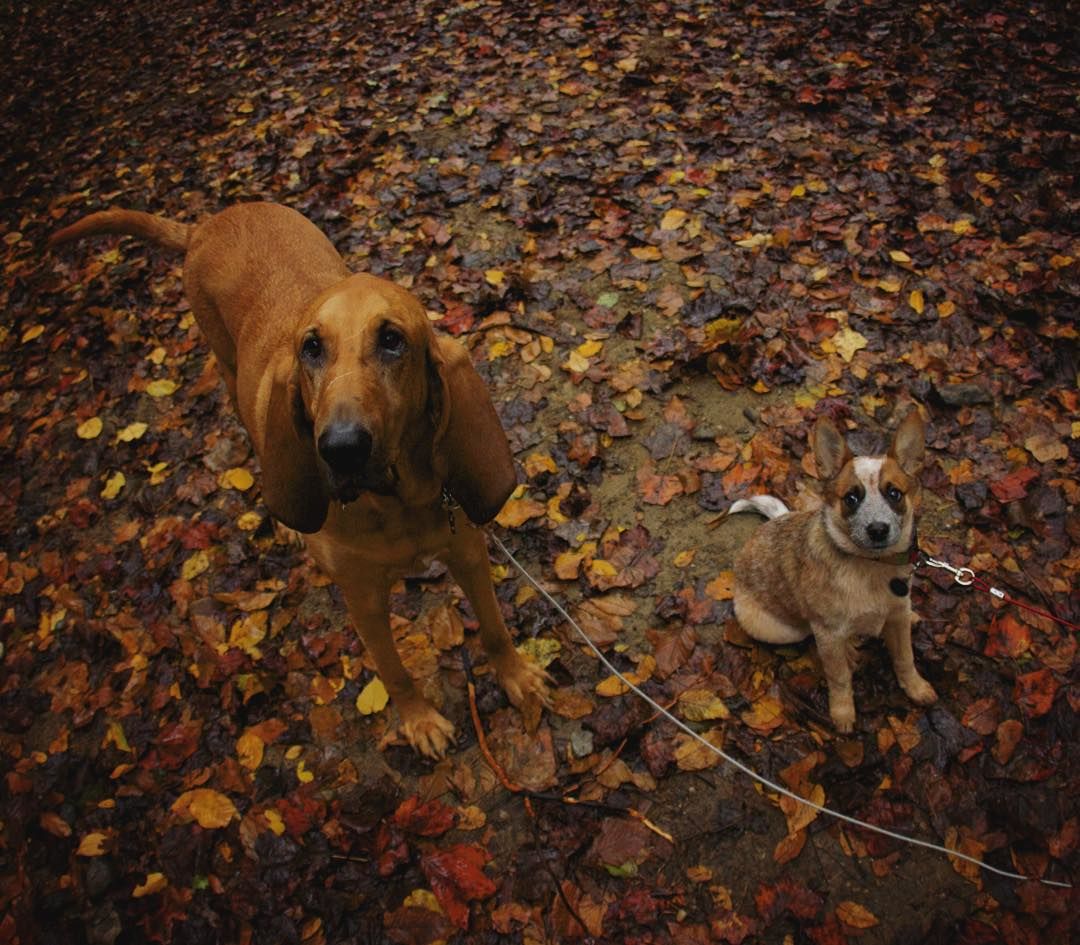
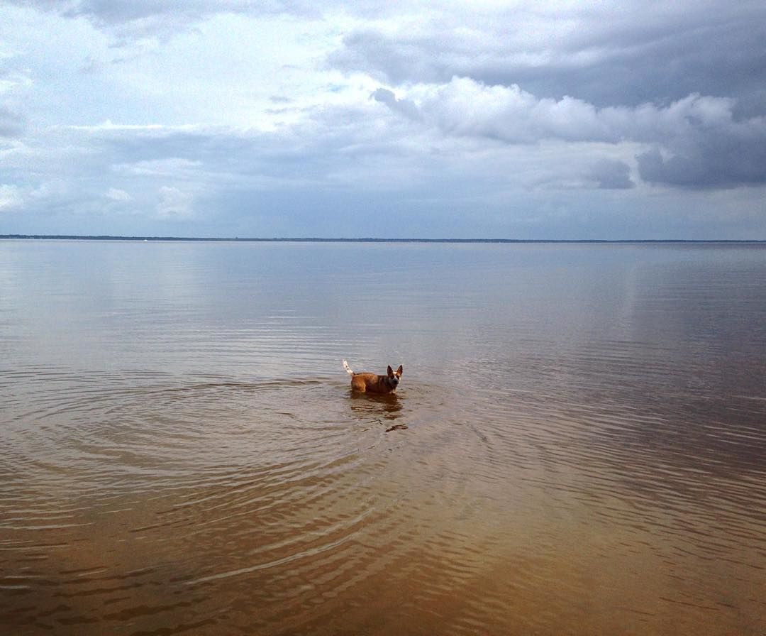
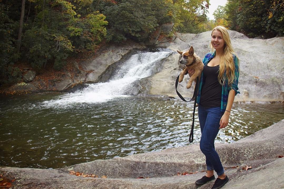
In my free time I hang out with my 3 year old Australian Cattle Dog, Jolene. She is the star of most of my photos and is what got me involved with the dog community online.
Not only do I take photos of Jolene, but we train together, specializing in trick training with a goal of moving into competition agility. I’m also passionate about canine nutrition, behavior and minimizing the environmental impact of domestic animals.
On this blog I plan to share ongoing design projects I’m working on, as well as dog related topics like well designed products, nutrition and training. If you’re into dogs and design, then this is the blog for you. I look forward to you joining us on our journey this year.


 After creating the color study for each image and assembling it into one InDesign