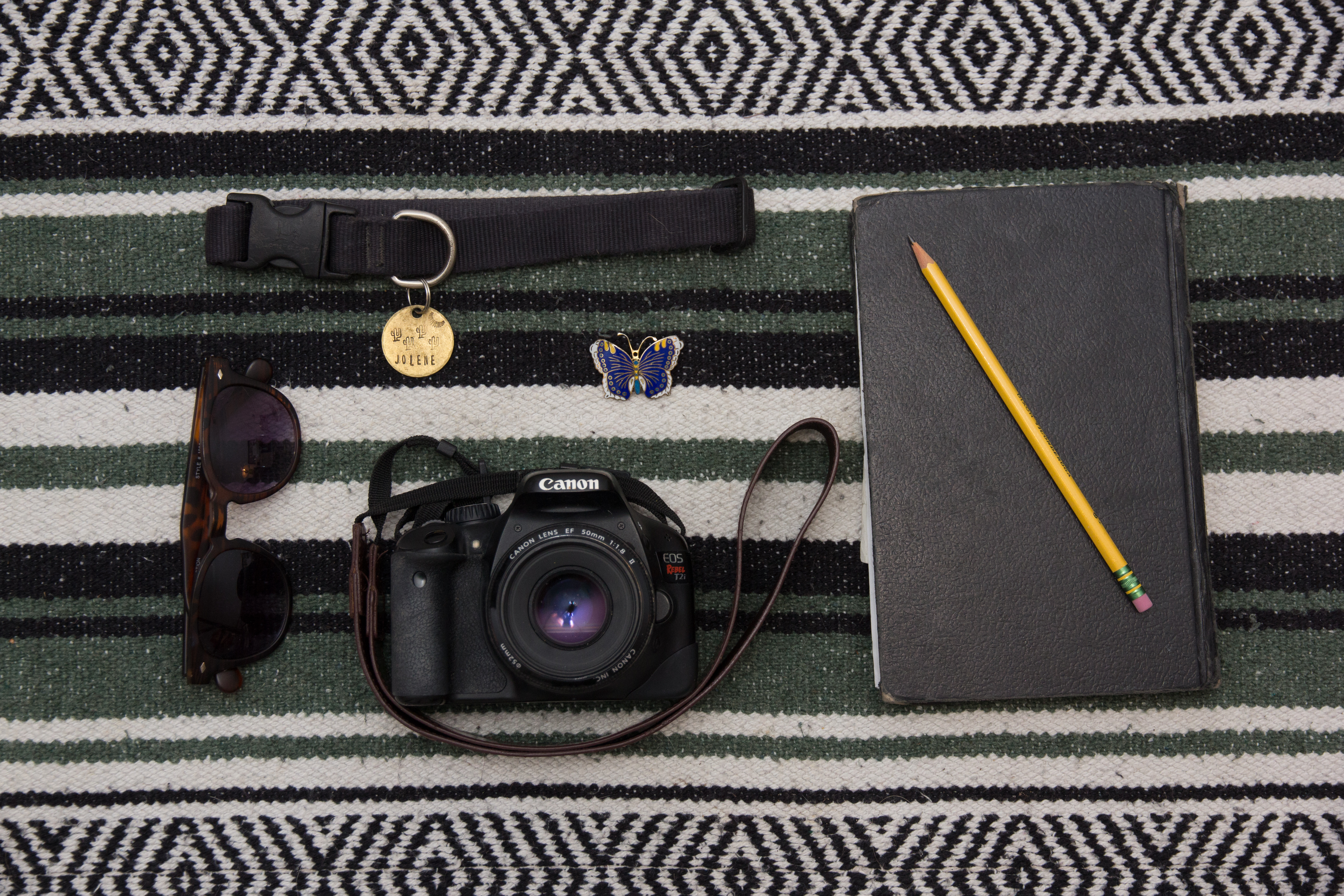
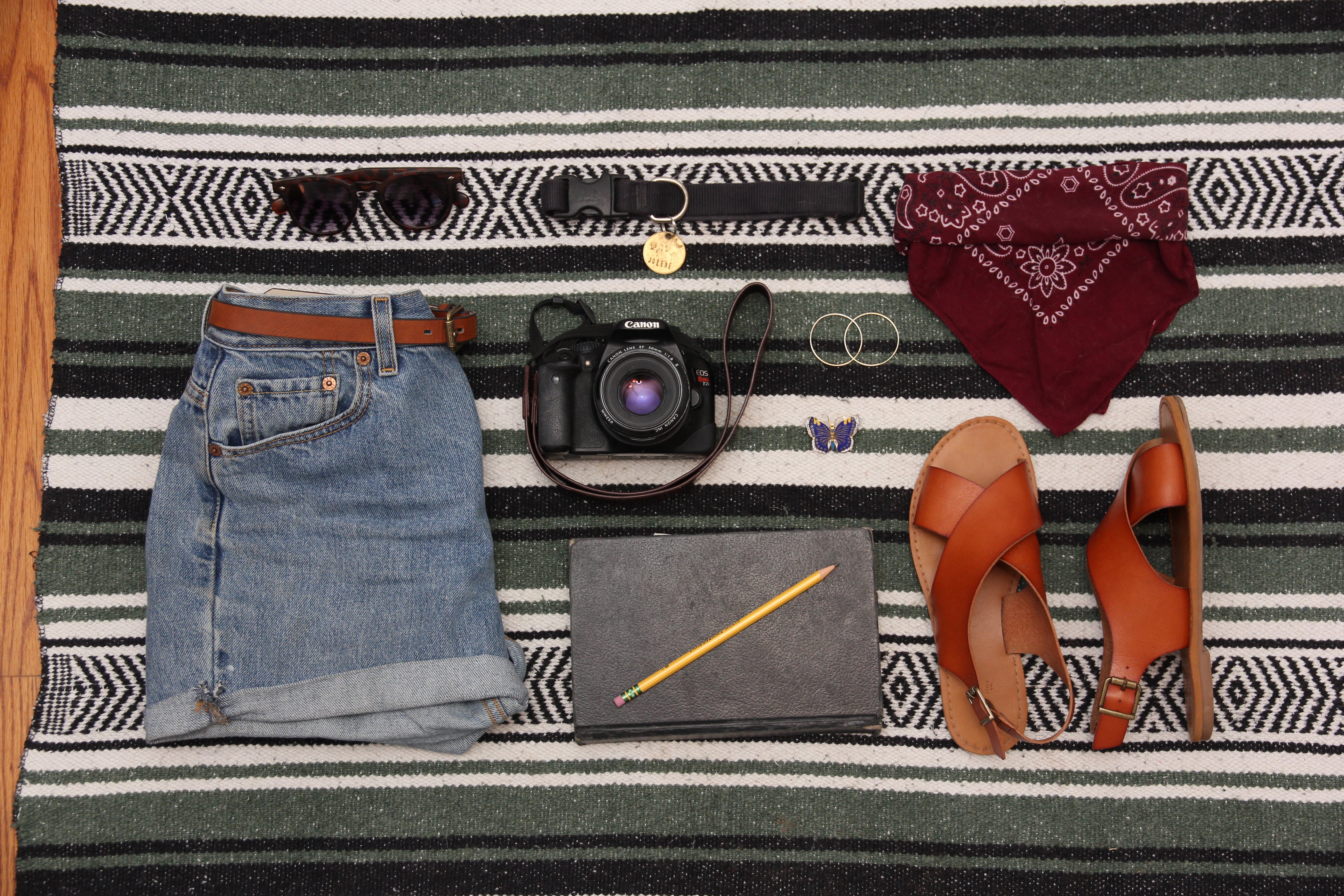
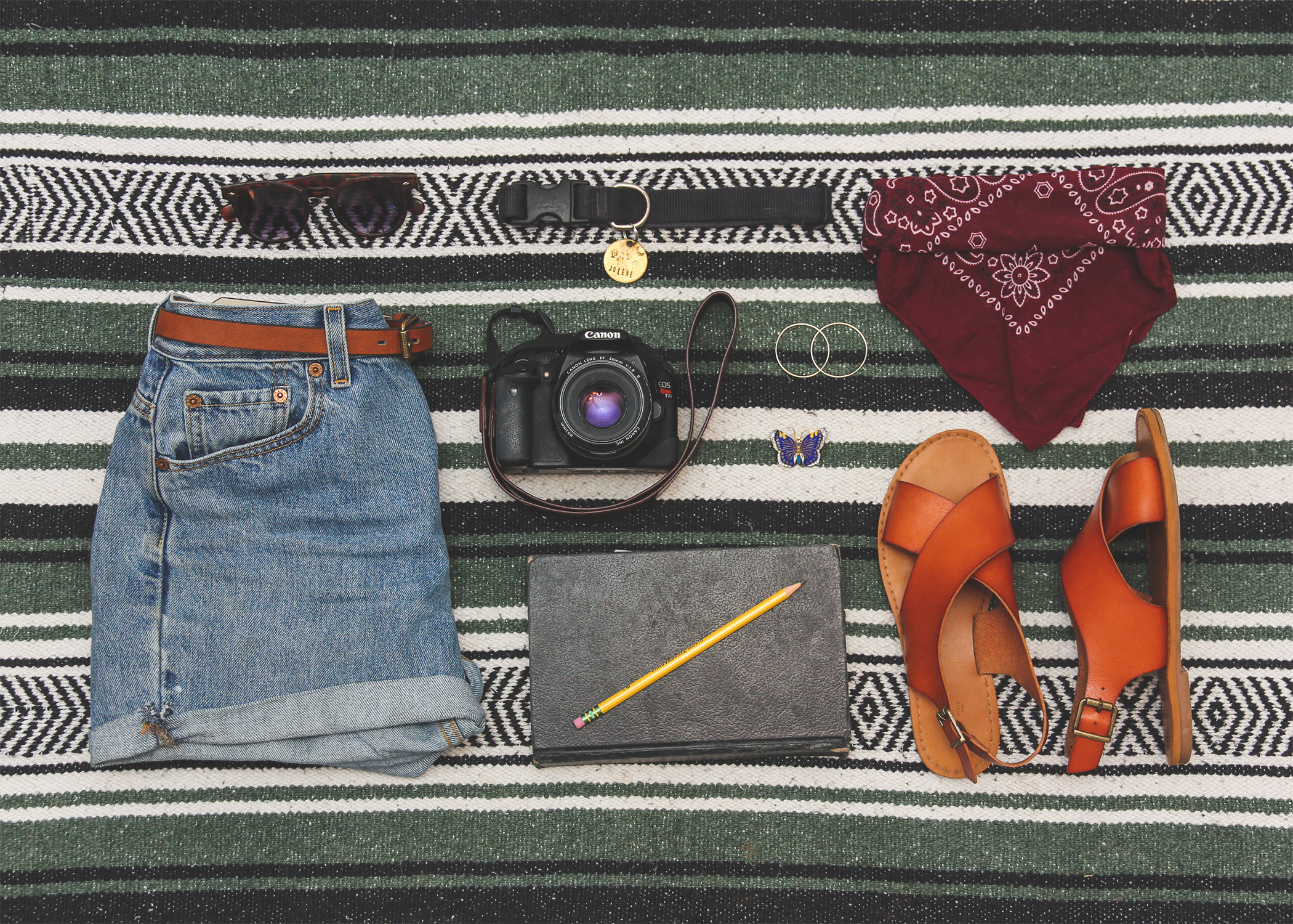
This week we were assigned to take images of objects that represented us. We were to shoot a group of 5 objects, 9 objects and 13 objects. Below are my three image options, unedited and uncropped.
Image 1:

Image 2:

Image 3 (Please note I will use content aware to fix this image so that it is not cropping the shirt out):

I look forward to hearing feedback from my peers!
Continuing last week’s project in which I took “knolling,” or overhead, grid-layout, photos of meaningful objects, I had to chose a final photo to work with. After posting my three photos, my peers decided my image with 9 objects was the strongest so I chose that one to continue the project with. Below is my final photo:

For the next part of the project, we were to take the image and add our name as a title, as well as a subtitle describing the image’s concept.
Below is my final image:

In the final image I used the liquify tool to straighten some of the blanket stripes so the text fit in the lines better and I also added a gradient overlay to help the text stand out from the background. I hope you like the final result!
All images are my own, except one grunge texture found on the creative commons: https://www.publicdomainpictures.net/en/view-image.php?image=169023&picture=grunge-background
Brushes used were downloaded with the Bad*ss Effects book.
